Atlassian has released a test version of the new Confluence Cloud editor and is currently asking for feedback. We've taken a look at the new editing experience to share how things will change in Confluence Cloud over the upcoming months. This new editor experience will later be added to Jira and Bitbucket Cloud. Atlassian will give users six weeks notice before they switch fully to the new editor experience.
Confluence Got a Cleaner Layout
Our first impression is a clean look and feel. You start a page with a fixed width centered to the page (with a lot of white space on the left and right) so that the view experience in nearly every resolution is the same following the "What you see is what you get" principle. If you need another layout, like two or three columns, you can use the new slash "/" command to open the column menu. Here you can control the width of the columns, make them a bit wider, or use the full width of the page.
Our impression
Once you've learned how to add a new layout it's pretty slick. We miss the possibility of having different sized columns, like a wider one on the left and just a small one on the right. Those layout options were great for adding more structured information on the page. For new or infrequent Confluence users, it will be hard to figure this feature using the slash command, which we'll talk about in a bit.
Having one centered default width makes pages much more readable; especially when writing articles and blog posts.
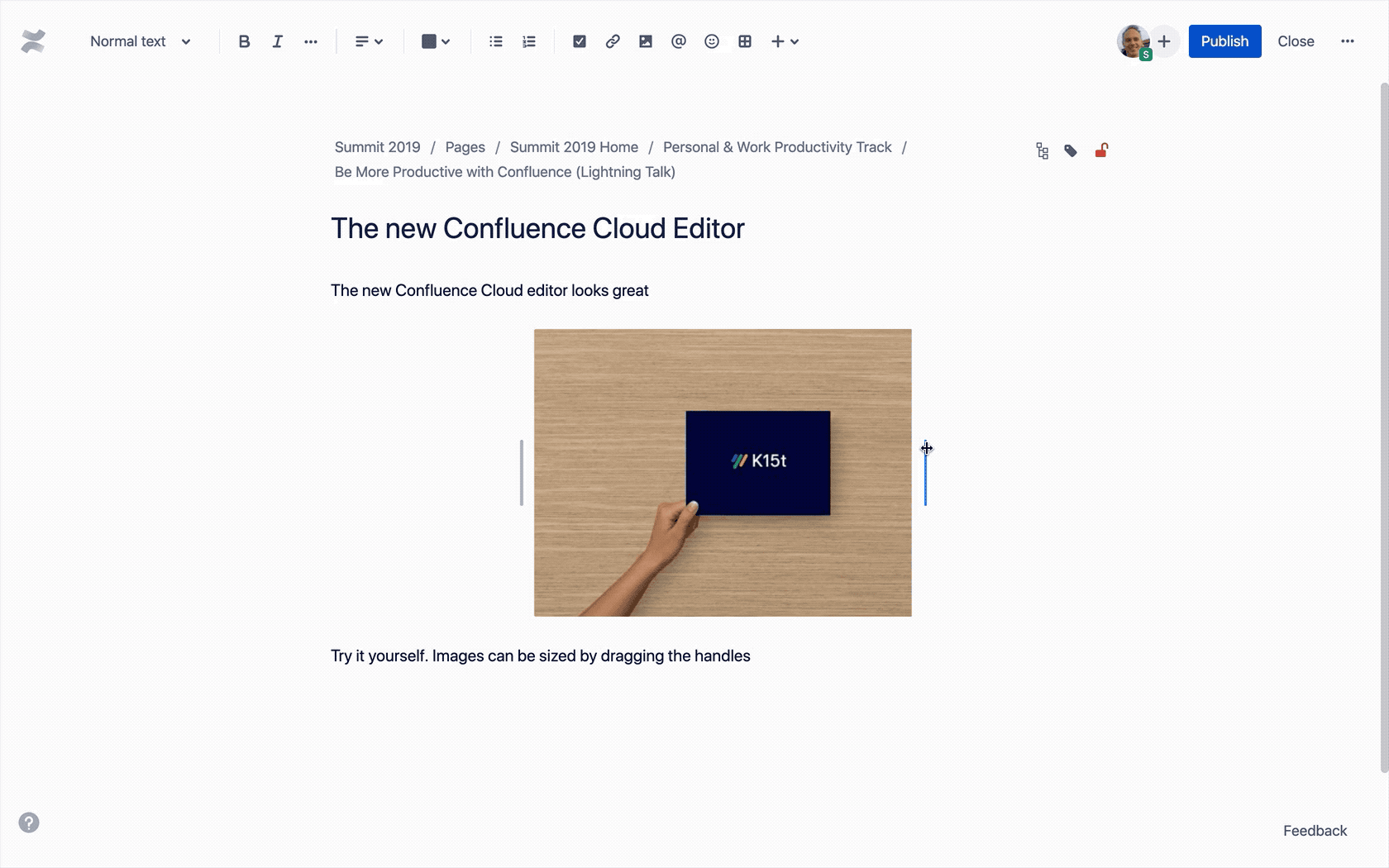
Working with Images Got a Whole Lot Easier
You can still add images by simply dragging and dropping them onto a page. Sizing images has been significantly improved: you can simply drag handles on each side of the image to make it larger or smaller. The image also snaps to grid lines, which helps with consistent image sizes on your page. If you view the page on a different-sized screen, the image also resizes to maintain the same proportions.
Atlassian also improved text wrapping. You can now control whether your text wraps around an image or not.
Our impression
Atlassian has added much more visual control to the images. Some people might miss the ability to set the exact image size in pixels, but we think removing it is a change for the better.
The New Table Experience
The table menu is now directly attached to a newly added table, right where the magic happens. You won't need to click anymore in the toolbar. Instead, you'll use what Atlassian calls the "contextual menu". You can easily add new columns and rows, merge and split cells, change the cell background, create numbered tables, and much more directly in the table. The column width can still be manually adjusted and the width of a table can either be the width of your layout column (with white space left and right) or span the whole page. Using tables becomes much more intuitive now by keeping nearly the same possibilities as the classic experience.
Our impression
The new table experience is great. Fewer clicks in the toolbar means you can be much more productive with the tables you create every day.
It doesn't seem like there's an option to choose responsive column width, so either every column has the same width or a manually adjusted width.
Choosing a smaller width for the whole table is also not an option now. The editor now fills either the whole layout column or the full page width. Smaller is not an option, but in the end, removing this option makes pages look more consistent.
The Slash "/" Command for More Productivity
The slash "/" command seems to be a new central concept in the editor for changing the page layout and quickly adding an element like an emoji, task, decision, date, info box, divider, or any other macro. Just type "/", continue typing, or pick from the menu to add an element.
The experience of adding macros has also been totally redesigned. Macros aren't just grey boxes anymore! Now, you can immediately see how the macro looks on the page as you edit it. This also means there is no extra menu to set up the macro. For example, when adding a status macro, you type the text directly on the page and pick the color. Macros like warning boxes and code blocks have had a massive visual improvement.

Our impression
The slash command is a much needed improvement. It does have a steep learning curve, but once you get used to it, it becomes a very powerful tool. The updated macros are now visually more appealing, which will help especially with those users who are not experienced with the current Confluence editor.
We do miss being able to just type a date and have it added as a date element. You now have to use the mouse to select the date on a calendar. This is just a demo, so we're hoping for an improvement here.
A New Editor for Better Adoption
The new editor is a big step towards adaptability and better acceptance in organizations. It looks modern and is – in a lot of aspects – much more intuitive than the classic editor. Users are given fewer options for layout, but this helps make pages look more consistent and improves readability. Existing Confluence users might miss a bit of the freedom and configuration details they had with the old editor. Change is always hard but we think in a year from now, Confluence Cloud customers won't miss the old editing experience, or even remember using it. Look for these improvements in your Confluence Cloud editor, and Jira and Bitbucket Cloud, in the near future.