Your users discover your product because they’re looking to solve a particular problem that matters to them. But discovery is only the first part of the puzzle. From that point on, the long-term success of any SaaS product depends on offering a great experience to the customer every time they interact with it.
In-app messages are the different elements that product teams use to reach, inform, and educate users within a product. They help users experience the product's potential from directly in the product, and it plays a crucial role in determining how soon users see value.
This brings us to a problem we’re all trying to solve – how can we keep users engaged and informed in a way that is valuable but non-intrusive, educational but also entertaining?
What is In-App Messaging and Why Does it Matter?
As we dive deeper into the world of in-app messaging, let’s start by looking at some benefits and why in-app messaging deserves a seat in your broader customer education strategy. We’ve broken down these benefits into two categories: the immediate gains that end users experience first-hand and the compounding benefits that add value to the product team over time.
Benefits of In-App Messaging
You know your product better than anyone else, which can sometimes influence your understanding of how easy or difficult it is for new users to understand it. You also can’t be there to handhold each new customer through their first few interactions with your product.
So what are your options?
Encourage success from the get-go
Your product onboarding experience is a good starting point to win over new users. But the way you choose to design this initial experience is just as important as the vehicle you use to execute it. Product tours and onboarding walkthroughs are great to give new users a glimpse into the benefits of your product.
Shorten the distance between signing up and deriving value
Good in-app messaging involves a little bit of everything. It requires great copy combined with a simple, fuss-free design. It needs to be educational, but also leave enough room for self-paced discovery. All these elements come together to reach the same goal – guide users towards their ‘aha moment ’ so they see value in your product in the quickest, best possible way.
Users easily find help when and where they need it
In an ideal world, all products would be easy enough to use without any guidance, but the reality is that products can get complex. Providing product information when the user needs it, within the context of the app they're currently using, is essential for users to use your product successfully.
Users don’t raise support tickets unless they need human intervention
The beauty of building an in-app messaging strategy that is built around the needs of the customer is that it pays back! These benefits can eventually impact the product team as well, since keeping users informed about improvements and product changes can also reduce customer tickets over time.
Your product roadmap is a true reflection of user needs
Your active users can be both your greatest champions and your starkest critics. By utilizing in-app messaging, surveys, and polls, among other communication channels, you as a product team can collect real-time feedback and data on user interactions with your products. This, in turn, allows you to design products that truly center around the user, thereby fuelling long-term growth and success.
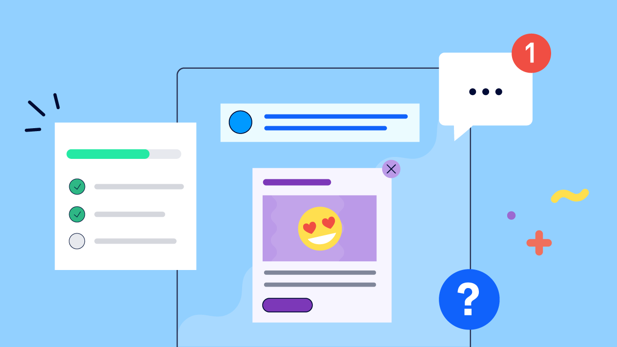
Types of In-App Messaging That Boost User Engagement and Retention
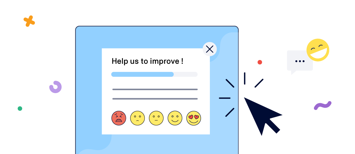
The significance and effect of in-app messaging are best appreciated when considered in context. As a customer, there are moments when a gentle nudge or tip is welcome, but there are also times when you prefer to be left undisturbed.
.png?cb=7d3690380952a8befc47111913edd820)
Let's explore a few types of in-app messaging and real-life examples of products that implement them effectively.
Download free extended article
Get our FREE extended article on in-app messaging, packed with additional examples and a detailed breakdown of our 4-stage process for building a successful in-app messaging strategy.
Checklists and tutorials
Picture this: you're a new customer who's excited to dive into a brand-new product or service. But as you navigate through its somewhat unfamiliar territory, confusion starts to creep in. You then get frustrated and decide to come back when you have time. Except, you never do.
The initial interactions with a product play a major role in deciding whether you’ll use it again, or even consider paying for it in the future. 63% of users believe that onboarding is a key factor in deciding whether to subscribe to a product. What’s worse is that 74% of potential customers will switch to other solutions if the onboarding process is complicated.
Onboarding checklists and tutorials are invaluable to new users. They simplify the process of getting started with a product or service by providing step-by-step instructions, highlighting key features, and addressing common questions that can be easily handled without human intervention.
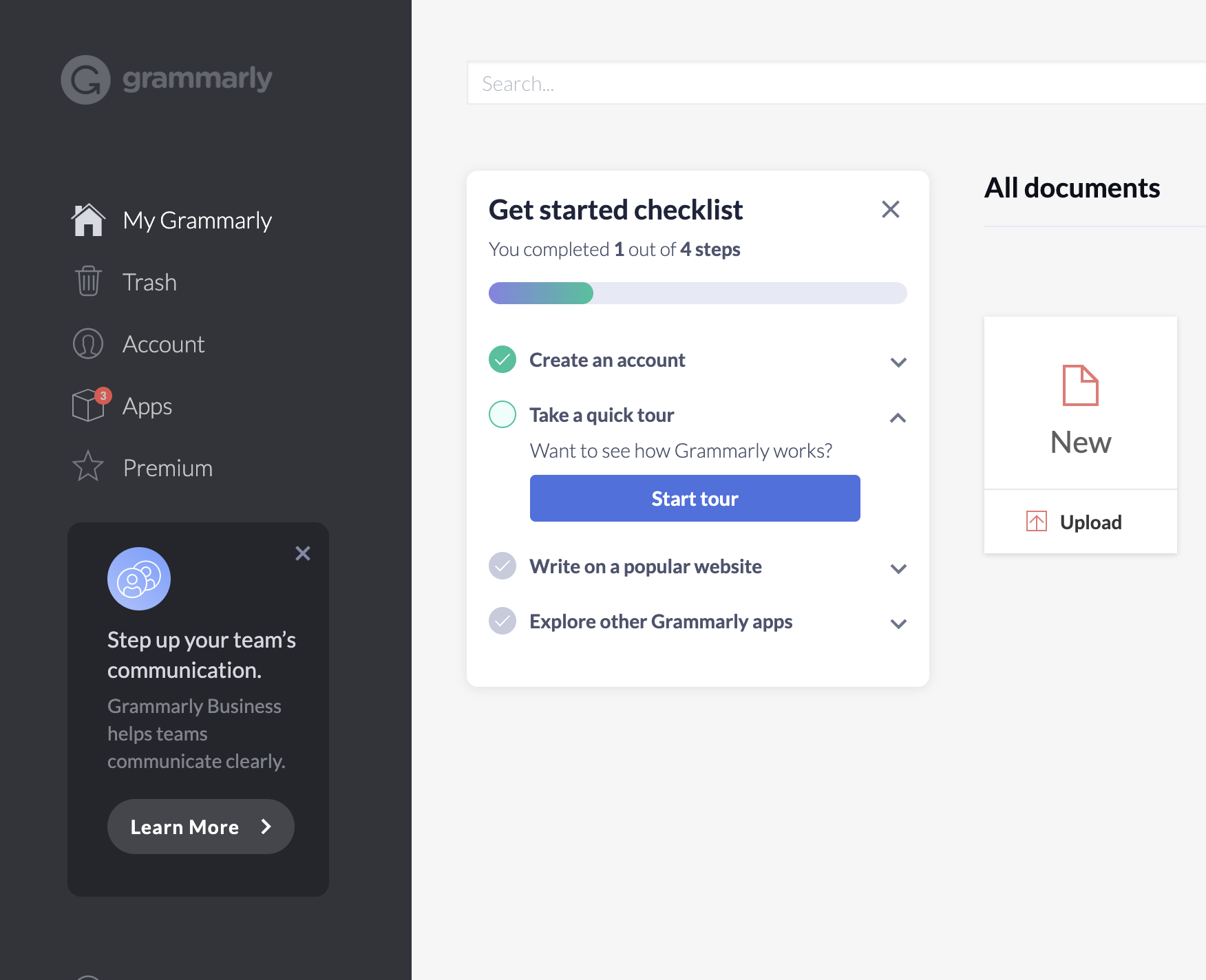
This getting started checklist is a great example of an onboarding tutorial that presents a short list of goals or activities a new user can use to discover Grammarly’s potential. Each step in the checklist includes additional features to go deeper, but this overview offers a good starting point to assess if and how the tool can help you improve your writing.
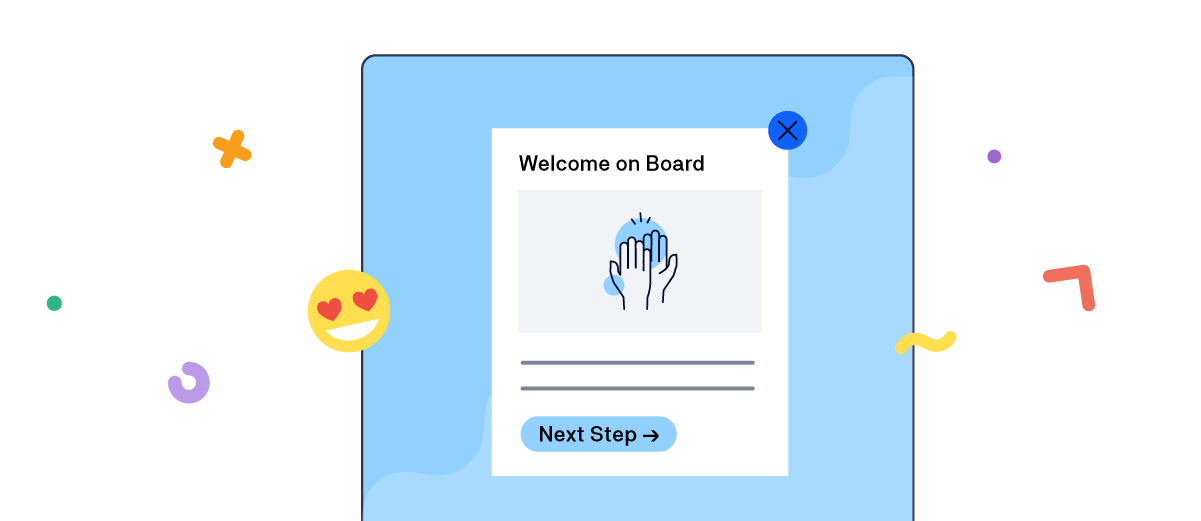
Welcome screens
A personalized welcome screen is one of the simplest ways to make a connection with a new user. It also allows you to collect additional information from the user that can help design the perfect initial experience tailored to their unique needs.
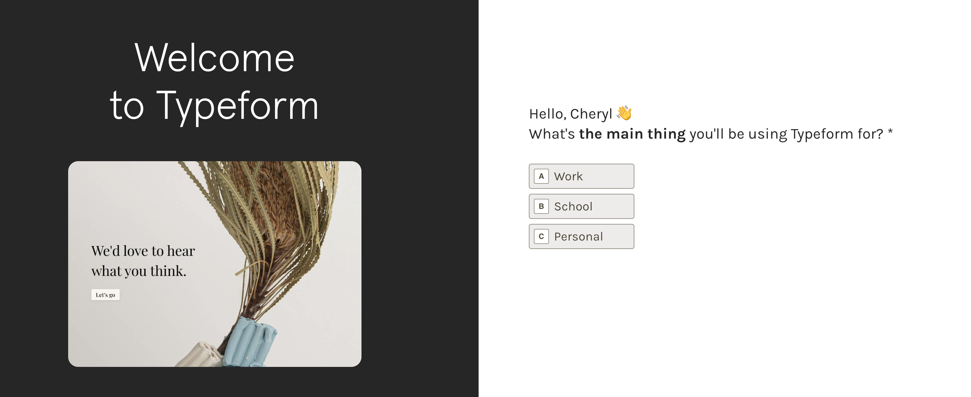
This welcome screen in Typeform is a great example of using the product to illustrate its value to a new user. One of the first things you do is answer this short Typeform that not only acts as a window into the product, but also helps to personalize the user’s journey in the future.
K15t experience
At K15t, we use Atlassian Confluence on a daily basis, and we onboard each new team member to the platform on their very first day. Atlassian is great at welcoming new users and providing a high-quality onboarding experience for Confluence.
Tool tips and prompts
Another good practice is to include small tips and practices that assist new users while they explore a new product. Even the simplest product has a learning curve and these tips can go a long way in increasing the stickiness of a product as new users find their way around it.
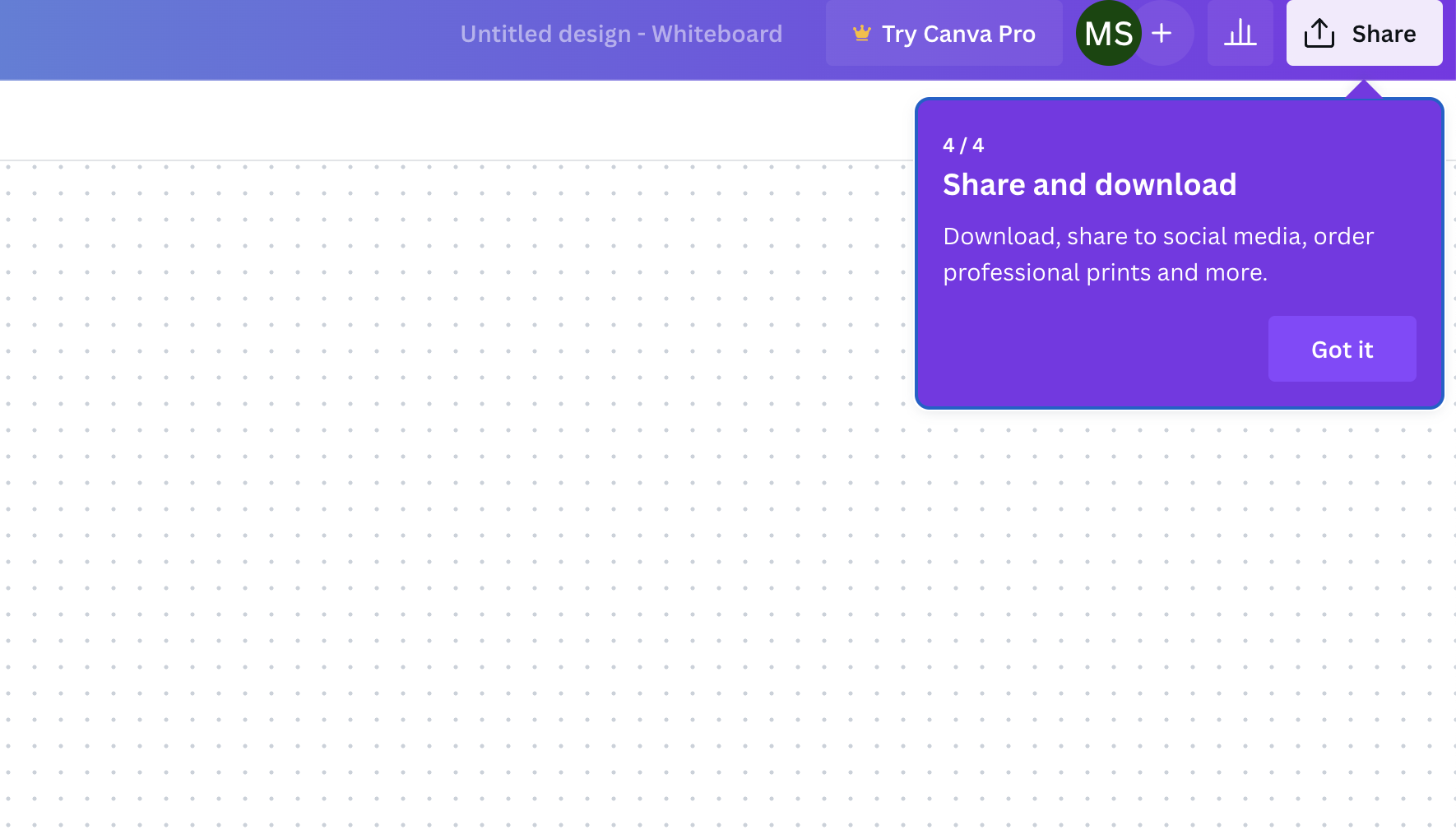
This series of simple prompts that appear as you start designing with Canva is a great example of providing practical advice in a non-intrusive way.
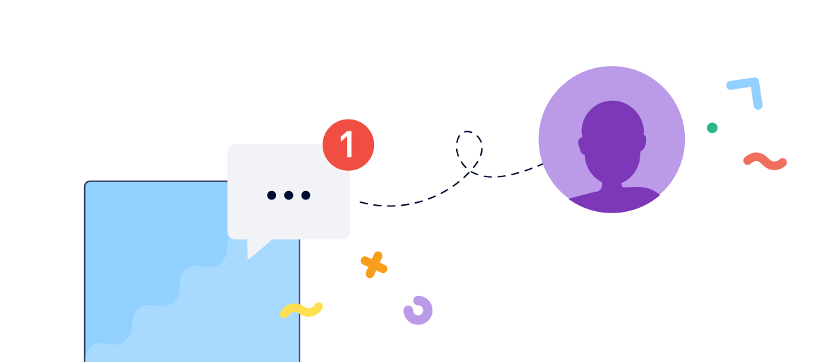
Modal popups
You work hard to deliver new features and improvements to your products, but are you certain that your users are aware of these updates?
This is a genuine problem that concerns the best product teams around the world. So much so that we recently published an extensive article offering tips and practical advice on writing more effective release notes where we illustrate these challenges and how we solved them.
But that’s only one part of the problem. Your beautifully-written release notes will stay hidden if your users don’t get the opportunity to discover them. In-app messaging allows you to keep users updated about enhancements and new releases as and when they happen.
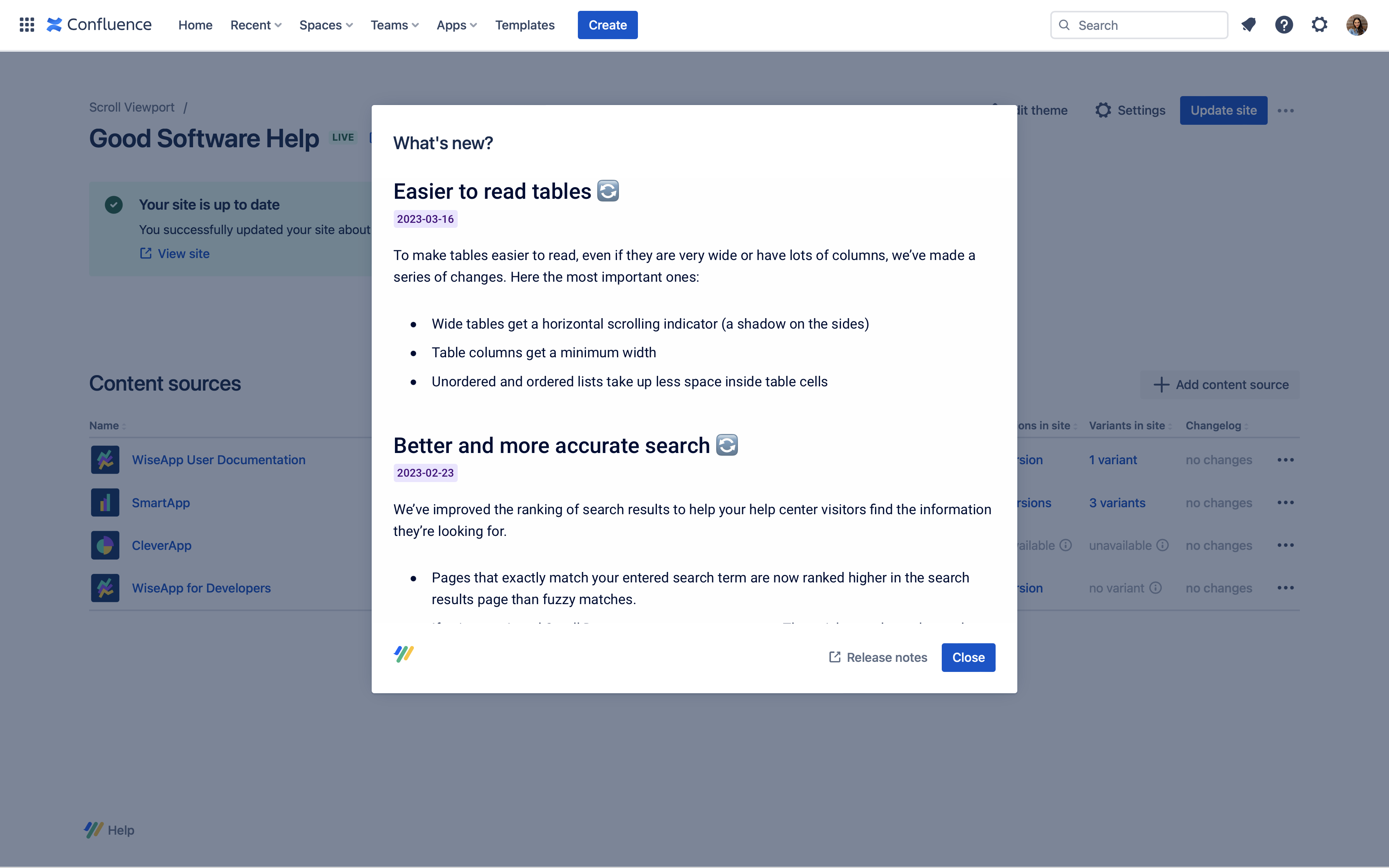
What is Scroll Viewport
Scroll Viewport is part of Scroll for Confluence, a collection of Confluence apps that let you manage and publish your team’s content and documentation.
Including a ‘What’s New‘ dialog box that opens a small summary of new improvements and updates is a great way to share changes with users without interfering with the user experience. It also allows users to easily access the release notes to better understand the feature if they want to do so.
K15t experience
It doesn't necessarily need to be a 'What's New' dialog box. For instance, Atlassian provides modals within Confluence that allow users to discover keyboard shortcuts, tutorials, feedback, and more. We find the keyboard shortcuts to be particularly helpful at K15t as they help us work faster with Confluence, and this is something we share with every new colleague.
Embedded in-app help
Context-sensitive help allows users to access relevant help content in the documentation by clicking on specific touchpoints within the software. However, embedding in-app help within your product will take this experience to the next level.
With in-app help, users can receive the assistance they need without losing context. By presenting help information directly within the product, it encourages users to remain engaged, understand how to resolve the issue they are facing, and solve it immediately without navigating away to external documentation.
Instead of taking users to the solution, you bring the solution to them.
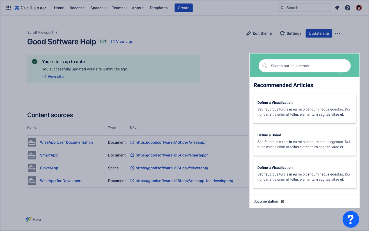
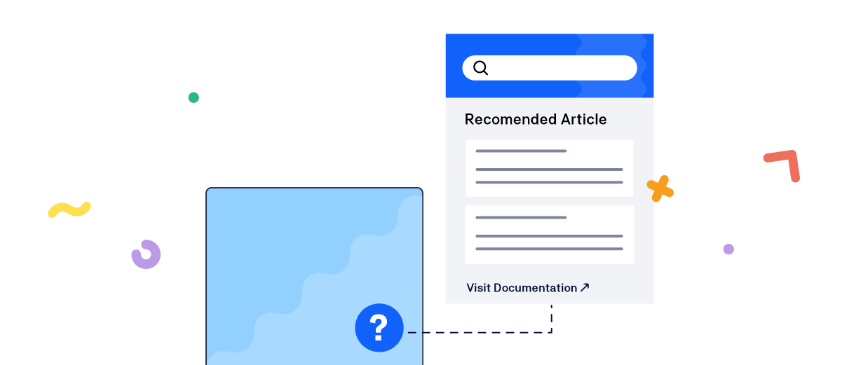
Scroll Viewport for Confluence by K15t is a help center solution that allows you to transform your Confluence documentation into visually appealing help centers. Its in-app help feature enables users to search for articles or browse through the most relevant content that is useful to them.
Implementing in-app help with Scroll Viewport is simple. Just copy the widget code from Viewport, replace the URL with the desired view to display in your app, and provide the code to your development team for implementation.
Why not embed even more helpful information?
Enable your users even further by embedding additional content for training, feature education, and support.
Buttons
Providing access to product documentation is just one element of the equation. Creating a sticky and memorable product involves making it so user-friendly that they don't even have to search for its value. This information should always be readily available, and easily accessible in a way that doesn't disrupt their product experience.
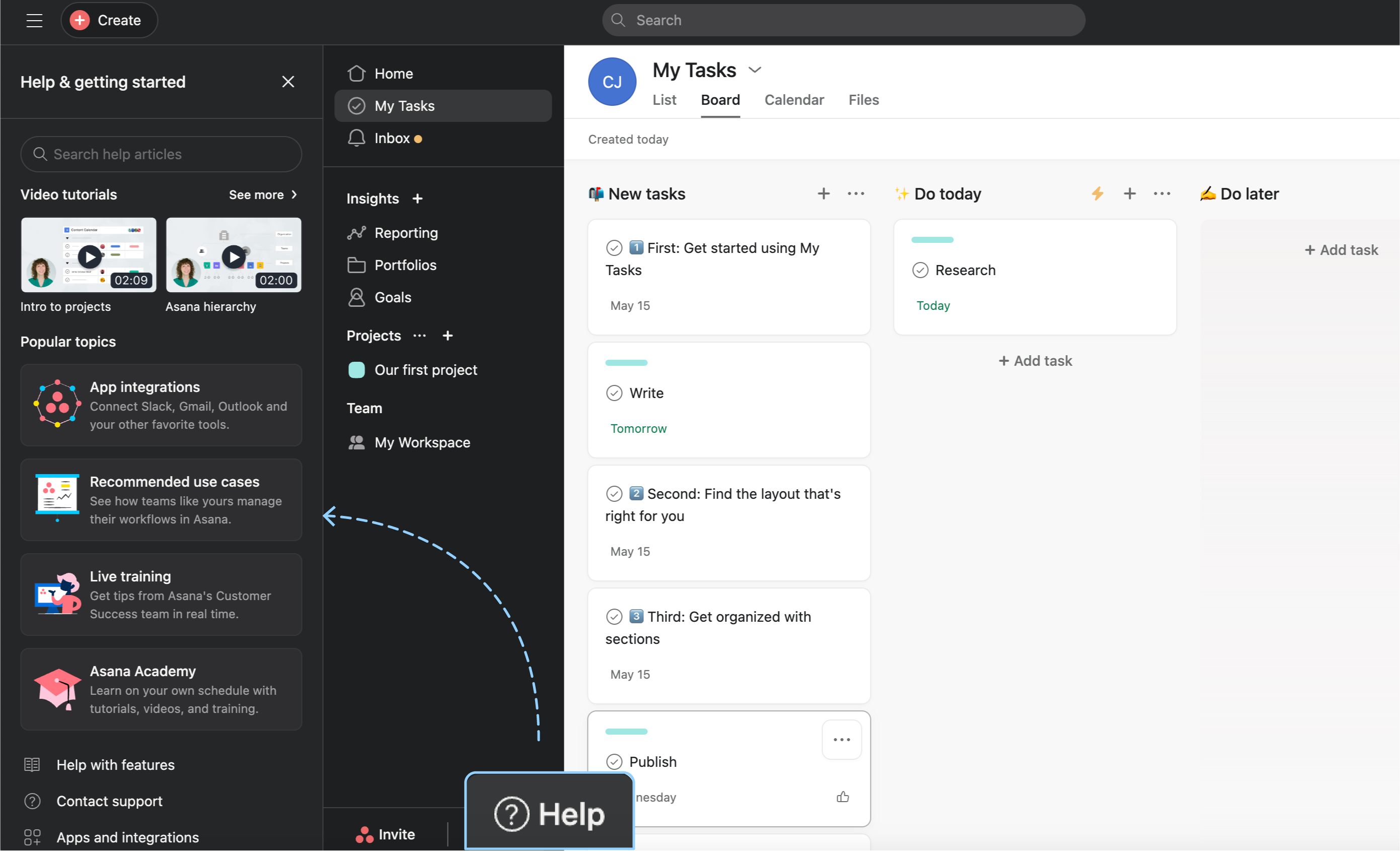
This useful and non-intrusive experience is exemplified wonderfully in Asana. With a subtle icon positioned near the bottom of the screen, users can access a window of helpful resources and advice presented in various formats, allowing them to choose what best suits their needs. This feature enables users to access video tutorials, explore popular topics, and even contact support.
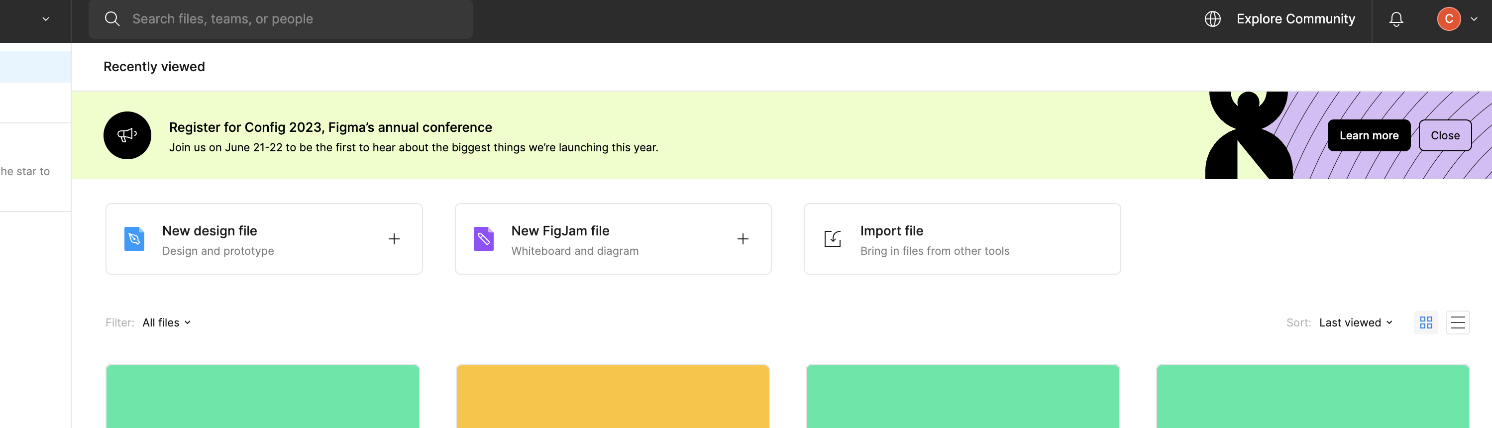
K15t experience
Another excellent example is Atlassian Confluence. Within Confluence, the help button conveniently consolidates all in-app messages into a single sidebar. Here, users can access context-sensitive articles, the community, keyboard shortcuts, and more. Moreover, third-party app vendors, like us, can also utilize this sidebar to provide helpful links for their respective apps.
Notification banners
Banner announcements are visually striking notifications that appear at the top or bottom of the user interface, delivering important messages or updates to users.
Regardless of their placement, banners are designed to capture the user's attention. Therefore, it's crucial to reserve them for only necessary and impactful information, rather than inundating the product screen with every minor update.
Some possible use cases for banner announcements include major product updates, upcoming events such as webinars or training sessions, and even important alerts regarding downtime or maintenance.
Labels and icons
The ideal time to recommend an upgrade or upsell to users is after they've experienced value in your product. However, it's important to remember that the goal is not to coerce users into purchasing unnecessary items, but to highlight additional use cases or features that can enhance the value they derive from your product over time.
Including labels and icons are a great way of hinting at upsell opportunities without making it intrusive or too ‘in your face’. This ensures that users can experience the product without disrupting their flow but also lets them explore additional paid features within the context of the product if they choose to do so.
Bonus: Best Practices for Effective In-App Messaging
After understanding the benefits of in-app messaging to educate and inform users throughout their journey, let's dive into some best practices and tips to keep in mind when crafting these messages.
Segment your user base
Different types of communication make sense to different users. Using existing data to understand which users would benefit from which kind of content, and at what stages is important while adding in-app messaging to your marketing mix.
Gathering this usage data over time will also unearth insights that can help fine-tune your in-app messaging strategy. But as a starting point – always tailor communication to user segments based on what matters most to them.
KISS: Keep it short and simple
This one’s a golden rule for any type of product communication. Irrespective of how many things you’d like to highlight to your users, remember that your users have a limited attention span – so use it wisely!
Your user interacts with your product to fulfil a particular goal or to solve a problem, so only offer content that will help them achieve that. No more, no less.
Always have a goal in mind
Having a clear goal can help you design your in-app messaging strategy and craft direct and compelling messages. Whether you're trying to guide new users through their onboarding, encourage them to upgrade, or nudge them towards new features, make it easy for users to reach the end goal with minimal clicks.
Review messages regularly and screen for relevance
Finally, one of the most important things to do is to constantly review your in-app messages and ensure that they’re up to date. There’s nothing worse than an outdated tool tip or unnecessary banner notification. Ensure you’re aware of all the possible communication flows across user segments and regularly screen them for relevance.
Interested in More Content Like This?
At K15t, we want to help teams share their knowledge freely, simply, and effectively to better educate and enable their customers. Subscribe to our newsletter to get updates on tools, tactics, and habits that can help you create a culture of knowledge sharing in your team.
Sign Up
Subscribe to our newsletter to get updates on tools, tactics, and habits that can help you create a culture of knowledge sharing in your team.