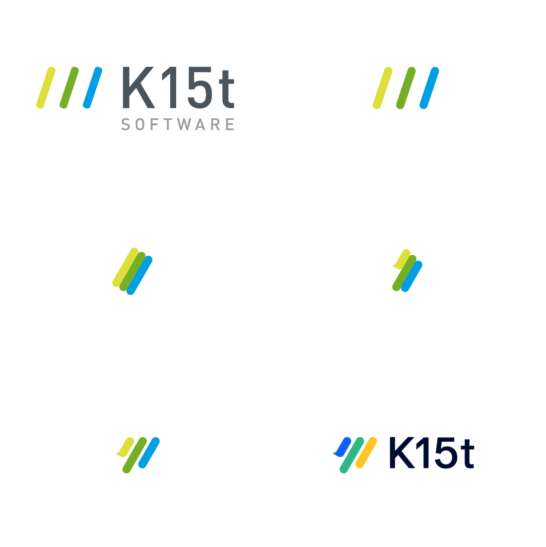
If you are reading this on the K15t blog, you've hopefully noticed a change – K15t has a new look.
Although our design team has continuously improved the visual appearance of K15t in the past, this is actually the first time we've introduced a new logo.
In fact, we've changed a lot more than just the logo. Over the past 18 months, our teams carved out our set of values, our mission and vision, and our brand. This brand refresh now reflects the changes that we've made internally.
A Bit of History
When my co-founder Tobias and I founded the company, we created the logo in just a couple of hours. It was based on a few sketches of three books – books that were designed to visualize content that had been authored in Confluence and then printed using our app, known as 'Scroll Wiki Exporter' at the time. Back then the designer reduced the books to three strokes in three colors and added "K15t" to it. A few weeks later we added the word "Software", and that remained the logo for the last 9 years!
Our design team has since improved the visual appearance beyond the logo – by adding a clear visual design language, new app icons, and well-received illustrations. However, at some point it was clear that we had to make a bigger change.
K15t Software : New Mission, New Name!
Amplify the Atlassian experience for everybody.
– Mission statement
The heart of the re-brand is the new logo which reflects our mission and why we exist as a company. During this process, we also decided to drop the "Software" in our name – we are now just "K15t" (Kay-15-tee).
The name change was an obvious one: We don't just build software – above all else, we provide solutions to problems. Our mission is about helping organizations, teams, and individuals ("everybody") get more from the Atlassian tools. While we do that in part through software (our apps), we also amplify Atlassian through our services, by participating in the community, and by living the culture.
Creating the new logo was not as straightforward as the name change, however. It needed to reflect our mission and our beliefs, and stand for the character of our company: We want to amplify the Atlassian experience in a friendly, straightforward, innovative, and competent manner. With that in mind, the new logo is a refresh of the existing logo, but with more density, a little hook on the first stroke, and updated colors. I hope you agree that it just looks better.
Fonts, App Logos and Website
But there is more: We've also updated our typography, our app logos, and our digital properties – especially our website and blog.
In order to improve the typography, we decided to get rid of the existing font-face (DIN Web): Although it is extremely popular, it is also very hard to read, especially online. The new fonts are a combination of serif and sans-serif types, that allow a lot better readability both online and on paper.
For the app logos, we agreed that we want to stick with the existing, recognizable shapes for each product logo to continue our existing design system and allow for recognition among our users.
The website and blog have been rebuilt from ground up: It's still running on Confluence and Scroll Viewport so our marketing team can update the website collaboratively in Confluence, but we've put a lot of effort into our very own Viewport theme and will share the whole story in an upcoming blog post.
One of our values at K15t is "Make great better!" and this is just as true for our brand, as it is for our products, culture, company, and us personally. We don't consider the brand to be "done", but this is a new chapter in our journey to improve.
Please add a comment below to let us know what you think.

