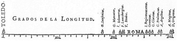
Did you know that the first known data visualization was created by Michael van Langren in 1644? It was a graph of statistical data, showing the wide range of estimates of the distance in longitude between Toledo and Rome. It looked like this:
And then we have William Playfair, who is mainly known for inventing the line, bar, area, and pie charts in the 18th century. Playfair argued that charts communicated data better than tables, and we think he had a point.
Tables often don’t really tell the full story of what you’re trying to communicate. Confluence is a perfect place to create great tables. To understand what you’re looking at, your team can use data visualization and charts to draw out valuable data insights.
In this article, you’ll learn how to choose the right chart in Confluence and apply simple best practices to make your data easy to understand at a glance.

What is Data Visualization in Confluence?
Before choosing a chart type, it helps to understand what we actually mean by data visualization in Confluence.
In simple terms, data visualization is the practice of turning structured data into visuals that are easier to understand. Depending on your goal, this could be charts, graphs, or even diagrams.
Diagram, Chart, or Graph?
Diagrams show how something works or how parts relate to each other, while charts and graphs visually represent numerical data. If you want to know how to improve your diagrams, you should give our article on beautiful diagrams a read.
Graphs are typically used to show how data changes or relates over time, like a line graph of active users per month, whereas charts are used to compare values or parts of a whole, such as bar charts or pie charts.
Once you know the insight you want to communicate, choosing the right visualization in Confluence becomes easier. When deciding how to display data, consider:
-
The trend, pattern, or vital piece of information you’re trying to impart at a glance.
-
How they navigate and interact with the data.
-
Making it as clean and beautiful as possible.
But typically, the first question is: “Which chart type is the best to display the data?” In the next section, we’ll answer this question.
When to Use Which Type of Chart
Once you’ve decided that a chart is the right visualization, the next step is choosing the chart type that best matches your data and message. No matter if you create a line, bar, or pie chart, you’ll need to make your chart readable at a glance.
As Playfair already argued, charts communicate data more effectively than tables. But a chart only works if it fits the story you want to tell. Before creating one, it’s important to be clear about the insight you want readers to take away and choose the chart type that supports it best.
In the following, we’ll explain what types of charts are best for each type of data. Keep in mind, we are only including charts that are natively supported on Atlassian Confluence.
Tip
If you don’t know how to create charts in Confluence go check out this 60 second video or read the Confluence documentation.
Bar Charts
Bar charts should be used for information that can be segmented into categorical data, such as age groups, license tiers, or types of devices.
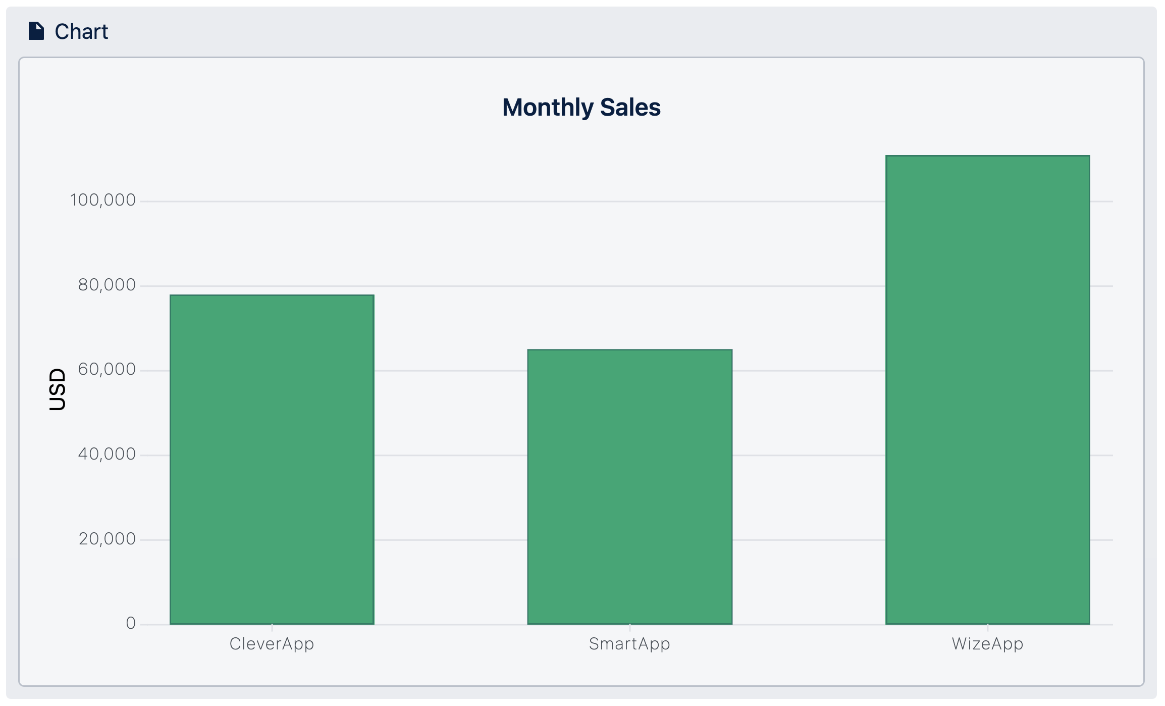
Keep the number of categories manageable. If one or two values lie far outside the typical range, the remaining bars become hard to read. In such cases, split the data into two charts to keep patterns and differences visible.
Grouped Bar Charts
Grouped bar charts are useful when you want to compare multiple values side by side within the same categories. They make it easy to see differences between groups at a glance.
You can also use them to display change over time, although it makes more sense to do this to draw attention to figures' totals, rather than the shape of the trend.
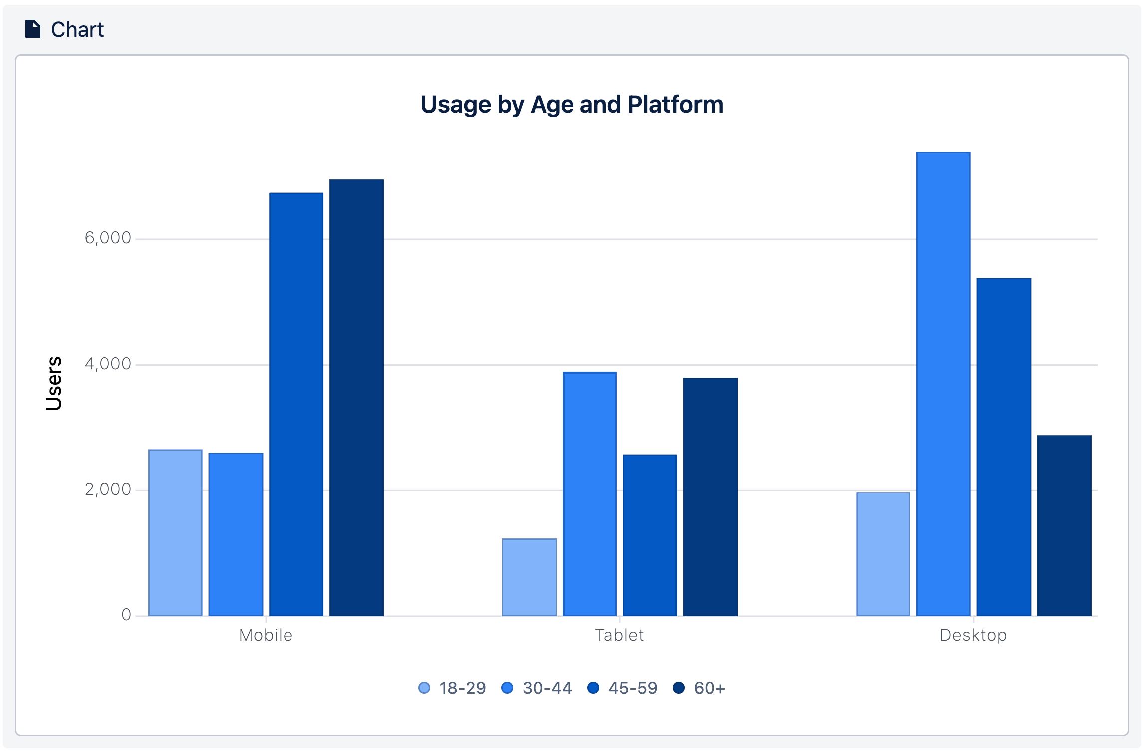
Ensure that you limit the number of values you are comparing. If you go beyond four values, you step into that visual math territory.
Aggregated Bar Charts
Aggregated bar charts in Confuence are helpful when your table contains many duplicate values, such as multiple transactions for the same product or repeated entries for the same category.
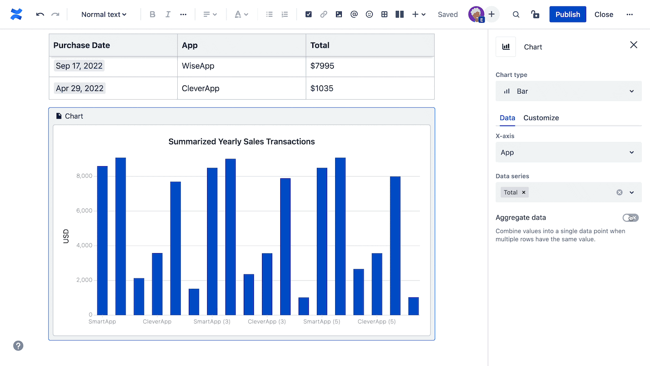
Instead of displaying every single transaction separately, we want to see them all together. This is just another way to keep bar charts clear and give new meaning to the data in your chart.
Line Charts
Line charts are popular for a range of business use cases, for they demonstrate an overall trend swiftly and concisely, in a way that’s hard to misinterpret. In particular, they’re good for depicting trends that include varying categories over the same period of time, to aid comparison. They’re also a perfect way to reveal trends and relationships between data.
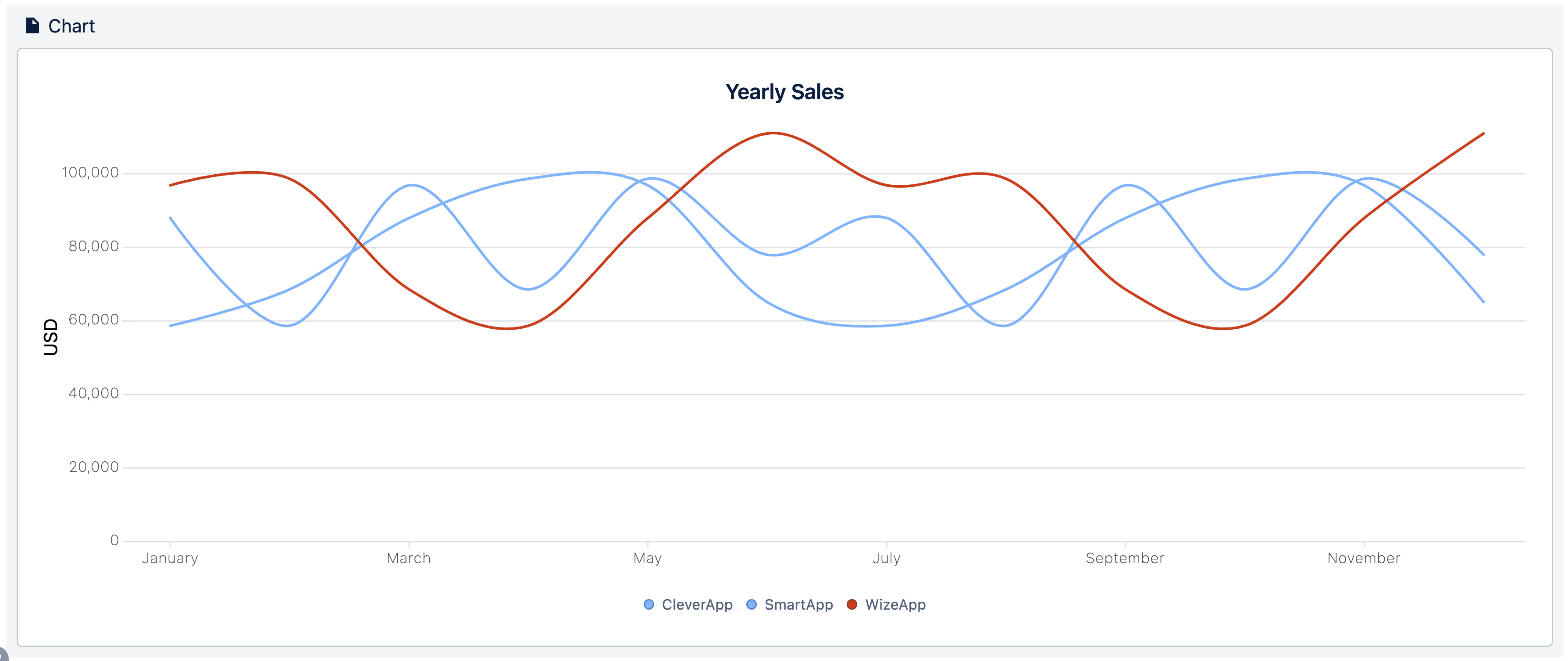
In a Confluence line chart, there should be a maximum of six series of data at a time. The more categories you try to visualize at once, the harder it will be for people to understand your chart.
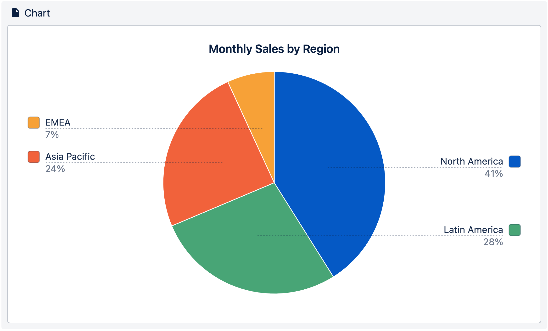
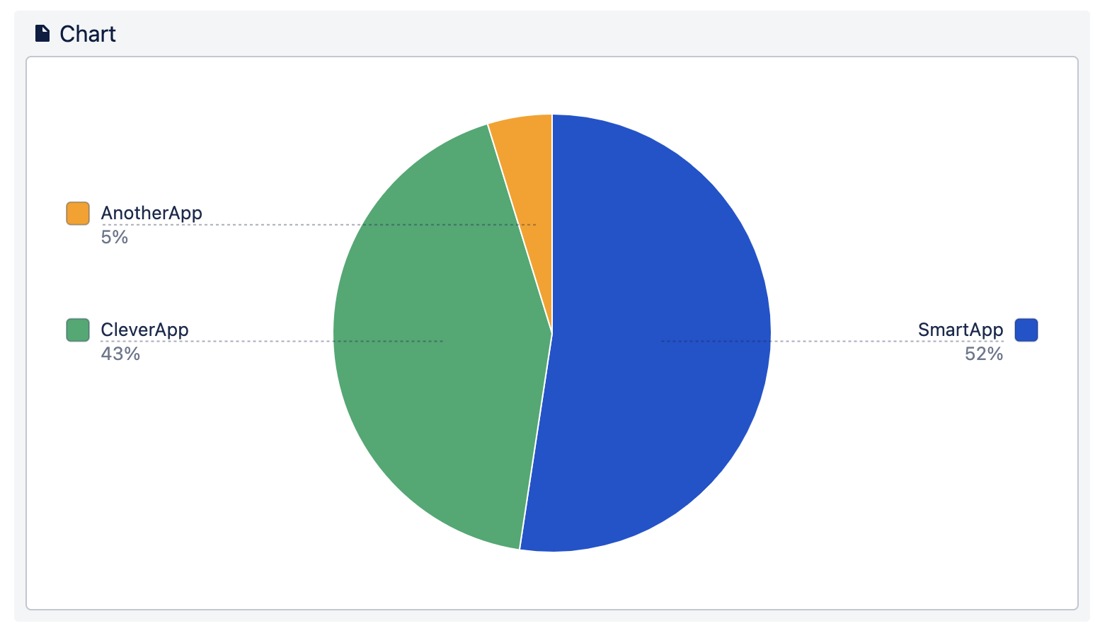
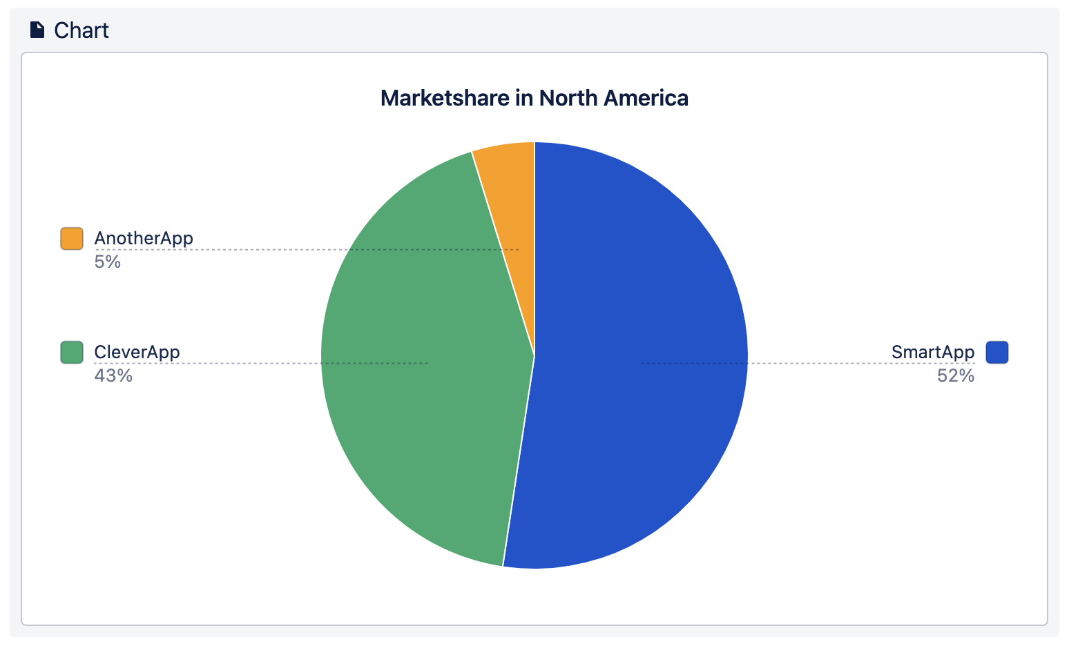
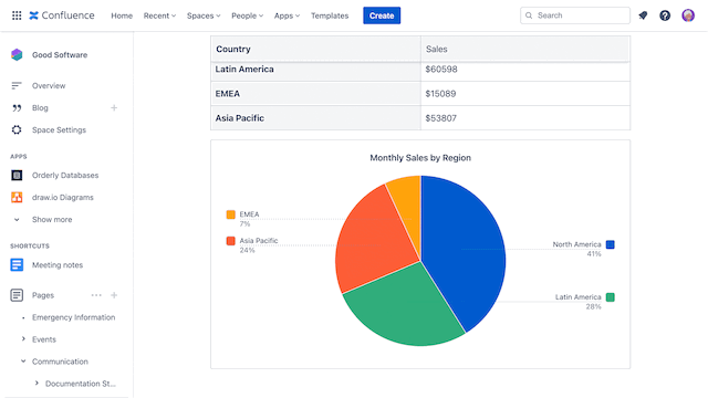
Pie Chart
Pie charts show how individual values contribute to a whole. They’re far more intuitive than simply listing percentages that add up to 100%. If you want to give your audience a general sense of how much each component takes in a whole, a pie chart is the perfect way to visualize it.
Visualizations and Context in Confluence
After deciding what type of Confluence chart best suits your data, it’s time to create your chart. But be careful, even the most suitable chart type can get messy and confusing for your readers. We’ve collected some tips and tricks about how to keep your chart clean, concise, and beautiful.
Add Enough Context
A chart alone can’t explain itself, and depending on the data, it can also be hard for your readers to know what they’re looking at.
To make your charts easier to understand, always include:
-
Titles and data labels: these will help people understand what the chart is about.
-
Legends: when displaying multiple series of data, a legend helps to give a better overview. Place it where the reader will immediately notice it.
If you’re unsure whether your Confluence chart provides enough context, ask someone for feedback to see if they understand it.
Color Makes a Difference
When it comes to making charts, color matters. As Jack Cieslak already found out colors can help to encode the data or categories themselves.
Here are a few practical guidelines for using color effectively in charts:
-
Keep Unrelated Data Distinct: Use universally distinct colors for the chart data series that are not ordered or related in any way.
-
Group Data with Perceptual Colors: Use perceptually gradient colors when your chart data series are in order. These will help people to understand data connections.
-
Group Loosely Related Data: A heated body scale of colors is great for illustrating chart data series that are ordered but without a set metric between them.
-
Group Closely Related Data: For data series that are ordered with a set metric, use different shades of the same color. With dark to light, any brain can naturally understand the close relation between them.
-
Highlight Important Trends: When highlighting an important trend in a line chart, use highly saturated and bright colors. Make the other trends in the chart fade into the background with desaturated and light colors. This creates contrast so your highlighted trend easily sticks out.
-
Same Variable Same Color: When you create multiple charts with the same variables, make sure that each variable always has the same color. This helps the reader to orient through your data visualizations.
-
Too Many is Too Many: This probably applies to everything in life, but especially to colors in charts. The more colors used to represent data, the harder it is to read the chart.
As you can see, colors make a difference when it comes to charts. If you have another best practice on colors, let us know in the comments below!
Keep 'Em Clean
So far, you’ve picked the best chart type, added information for context, and applied well-fitting colors. But even after all that, there’s still a possibility that your Confluence chart could fail at communicating data in an easy-to-understand way. Here are some common issues and simple ways to fix them.
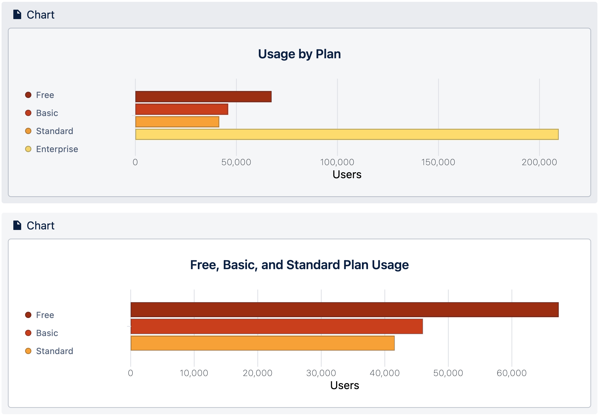
Data out of range
When some values are far outside the typical range, the remaining data can become difficult to read.
In these cases, consider creating a second Confluence chart that focuses only on values closer together. This way, readers can get more detailed information of your visualized data. Try keeping the form of a chart consistent across a series, so that differences will pop out between charts.
Over-saturated charts
If your pie chart has a lot of 1% or <1% slices, combine those data series in your table. Too many tiny slices make pie charts difficult to read because the range is overblown. If this data is important to show separately, try the approach from above, and create a second chart to focus on those smaller values.
The actual data is distracting
Sometimes the raw data in a big table can distract from the chart. Either beautify the data in the table or hide it. You could put it at the bottom of the page, in an Expand, or both!
Try the “Squint Test”
Dr. Abela has a final pro-tip to ensure that your chart communicates your visual data perfectly. This is called the “squint test” and it checks that your data makes sense even without seeing the details of it.
Here is how it works:
-
👀 Look at your chart and squint.
-
🥇 If it still makes sense even with some blur… you have a winner!
If you’ve read through the whole article, you now have the knowledge to masterfully display your data in beautiful charts!
