🤝 The Intranet That Brings Us Together
Starting a new job is never easy—especially when you're not bumping into anyone at the coffee machine. Without face-to-face moments, getting to know your tools, your team, and where everything lives can be a real challenge.
That’s exactly why we rely on Confluence. And with Confluence Premium (or higher), the Company Hub takes it to the next level. We’ve built one we truly love, and we want to show you how we did it. It helps us share what matters, stay in sync, and keep our values visible.
💡 Knowledge Empowers Teams
We get it. Everyone’s busy, and there’s little time for things that feel “nice to have.” Internal news often gets ignored (unless it's a bit of juicy gossip). But knowledge creates strength and connection.
The more people know about what the company stands for and what’s going on, the more they feel like they’re truly part of it. Studies prove it: Teams work 20% more productively, make better decisions, and feel more satisfied in their roles. That’s why investing in a proper intranet is absolutely worth it.
✨ A Page That Feels Like Home
As soon as Atlassian shared their post about creating a Company Hub in Confluence, we couldn’t agree more with the idea: Your intranet should reflect how your team works, communicates and connects. We wanted ours to be the best of all worlds: functional and inviting using a mix of structure, smart macros, and a little design love. So we started with a clean layout and added just enough structure to guide people without overwhelming them.
Here’s a peek at what K15t’s intranet looks like:
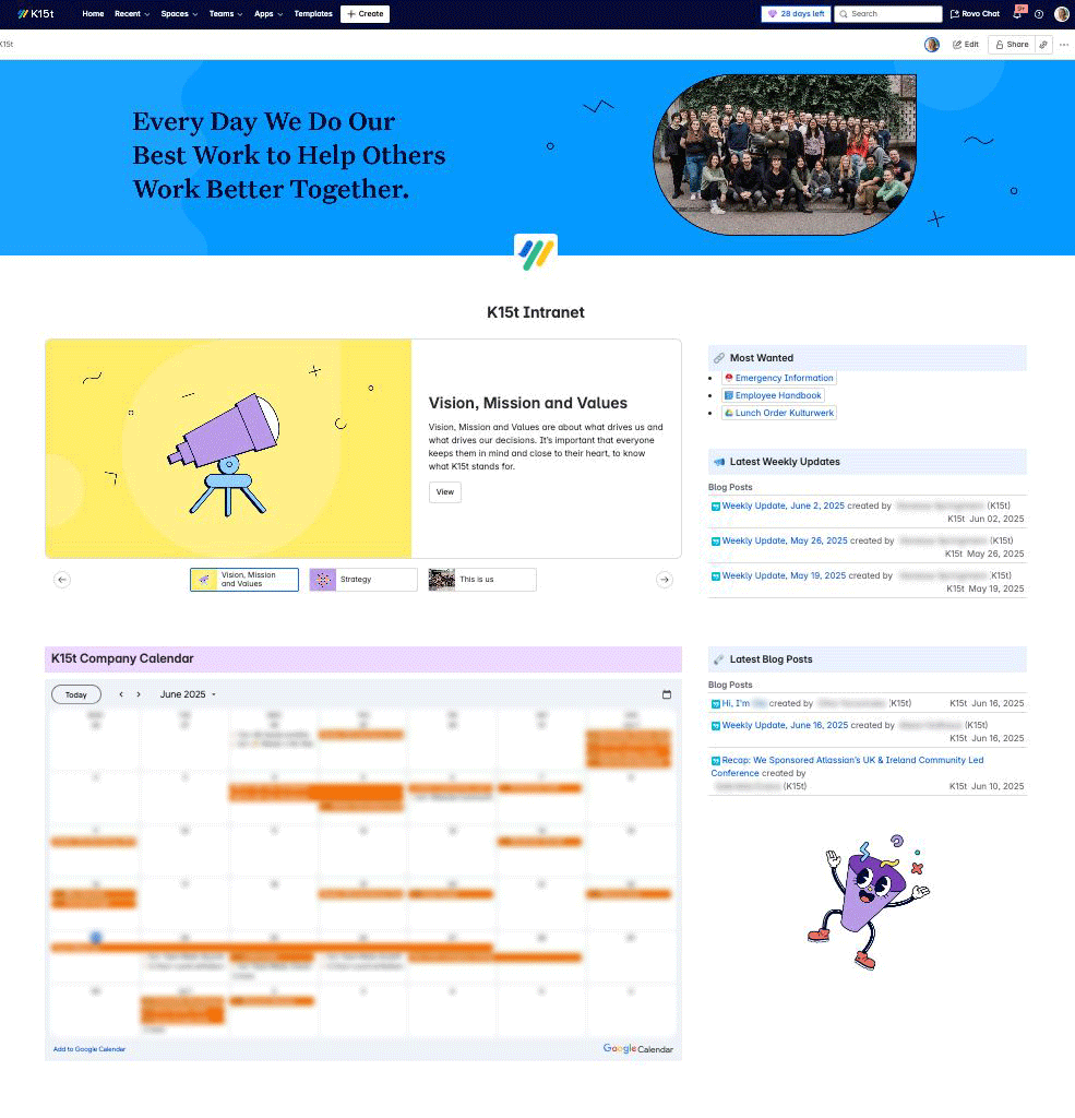
Now, let’s have a closer look at how we built it!
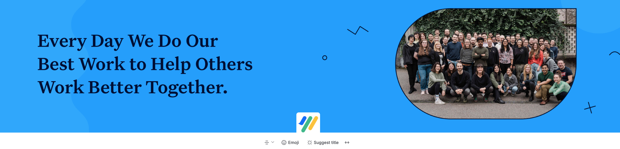
🚀 First Things First
When you open Confluence at K15t, the first thing you see is our mission – front and center. Just below it, there’s a photo from our last Team Week, added with a standard image block. It’s a simple touch that adds warmth and a human feel to the page, and it sets the tone right away.
🧩 Macros That Make It Shine
The main layout of our intranet uses a two-column section: two-thirds width on the left, one-third on the right. It’s a simple structure that strikes a nice balance between context and clarity.
Our Values, On Rotation
The larger left column features a Carousel macro that highlights our vision, mission, and values. Each slide links to deeper pages about our strategy, principles, and the people behind it all.
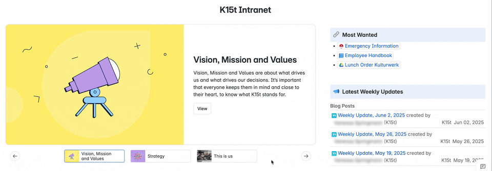
We want our values to be easy to access and easy to remember. That’s why they’re not just written down, but built into the experience. The carousel can rotate automatically or manually, so you can explore at your own pace.
Your Sidebar Source of Truth
The right column features the content our team looks for most, starting with quick links to key Confluence resources (yes, including the lunch menu).
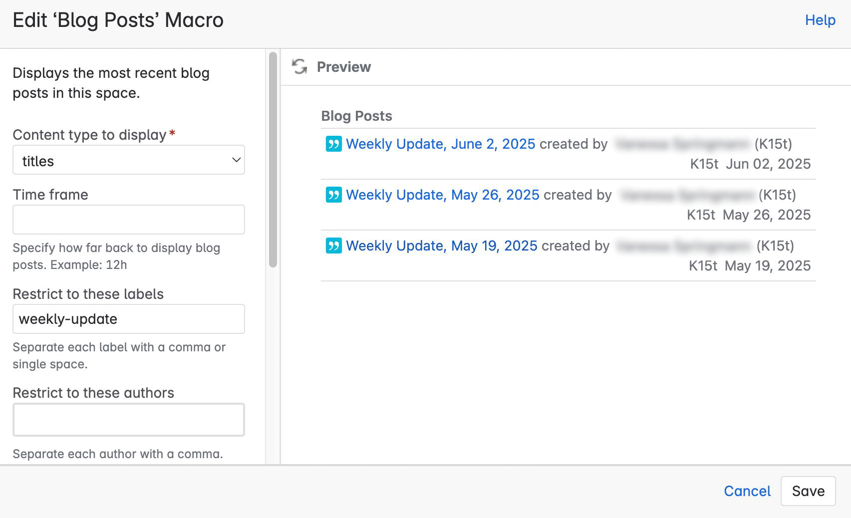
Just below that, we use two Blog Post macros. The first shows our Weekly Update Posts (WUP), filtered by the “weekly-update” label. These go out every Monday to give everyone a snapshot of last week and a preview of what’s coming.
Right after that, we show the all latest blog posts across the company. It’s our way to stay connected to what other teams are working on.
Dates That Matter
At the bottom, we’ve embedded our shared Google Calendar. It’s one of those small features that quietly make a big difference.
It shows upcoming birthdays, ACES, anniversaries, and company-wide events, so everyone can stay in the loop and celebrate the moments that matter.
🌱 Share and Connect
This is how we built a space that works for us. Yours might look different, and that’s exactly the point.
If you don’t have a company intranet yet, we highlight recommend setting one up. It doesn’t have to be perfect from day one, but having a central place where people can find what matters, stay informed, and feel connected makes a real difference.
For us, it’s a space that supports both the work and the people doing it.
Maybe it could do the same for your team.
Confluence News
Telepointers, but Smarter
Confluence now shows just one cursor per person (even across multiple tabs), displays full names on hover, and lets you jump to where someone’s editing with a click. It’s a small change that quietly makes real-time collaboration feel more focused and less chaotic.
Benefit from Monthly Confluence Tips

Join our Monthly Dose of Confluence newsletter and discover smarter ways to work, publish, and collaborate in Confluence.