This time, we’re diving into the latest Confluence Cloud update: layouts that actually work with you. We’ll show you how to bring more structure to your pages, and how to tell if readers are actually sticking around long enough to notice.
😩 “The Idea Was Solid, the Page… Less So”
You start with good intentions (hopefully!).
You're building a helpful page in Confluence. Maybe it’s a how-to guide, a release checklist, or onboarding for new teammates.
But halfway through, it all goes sideways.
Not your writing. Just the layout. Everything feels crowded, misaligned, and just a bit... awkward.
You try to fix it. You use a table. Then a section. Maybe some bold text and a few emojis to spice things up. Eventually, you give up and hit publish, hoping the team understands it anyway.
Yep. We've been there too.
🎉 What's New: Layouts That Work With You
Confluence Cloud just rolled out a layout upgrade that actually gives you control. The kind of control that makes your content not just usable, but clear.
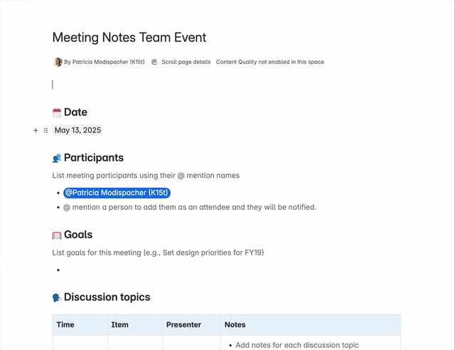
Let’s say you're documenting meeting notes—because you’re nice.
Simple in theory. But if you’ve ever tried cramming agenda items, decisions, links, and action points into one scrolling column, you know it gets messy fast. Now you can fix that without resorting to tables or formatting acrobatics.
🧱 Create up to five columns
Before this update, Confluence allowed for basic layouts with up to three columns—left, center, right. That was enough for simple structure, but it didn’t give you much flexibility. Now, you can create up to five columns in a single layout section.
That means more ways to organize complex content, compare things side by side, or just give your info room to breathe.
But fair warning: just because you can use five columns doesn’t mean every page needs to look like a dashboard exploded. Don’t stack long paragraphs across skinny columns.
No one wants to work that hard just to understand a page.
So when does five-column layout make sense?
Use it when you’re:
-
Comparing product features at a glance
-
Breaking down tasks by team, role, or week
-
Listing quick-reference facts, links, or steps
-
Creating a dashboard-style overview with multiple content types
If you’re writing long paragraphs or need readers to focus on one idea at a time, fewer columns are still your friend.
Keep it simple, keep it skimmable.
📐 Layouts in Tables, Tables in Layouts?
Good news for all the formatting enthusiasts out there: Yes, you can nest tables inside layout sections.
That means you can build a clean two-column layout and drop a neatly formatted table on one side. Perfect for side-by-side comparisons, meeting agendas, or feature checklists that deserve a bit of structure and style.
But a quick heads-up: layout sections can’t live inside table cells. Not yet, anyway.
Fingers crossed it’ll change soon!
Confluence News
📊 See Who’s Actually Reading Your Pages
Confluence now shows you engaged views. That means you can see whether someone stuck around for at least 20 seconds (aka, actually read your content), or bounced faster than you can say “draft v7.” This is perfect for spotting which pages are doing their job and which ones might need a layout or content fix.
🔗 Where Readers Come From - and Go
The new linked Content analytics helps you map out your content journey. You can now see inbound links and outbound links. It's designed to help you understand how your content is connected and whether your “further reading” links are being utilized effectively.
From K15t
Want to take it even further?
If you’re ready to turn clean layouts into truly beautiful Confluence pages, we’ve got you covered.
We’ve collected formatting tips and layout tricks that we use ourselves. Your team will thank you for pages that are easier to read and nicer to look at.
Benefit from Monthly Confluence Tips

Join our Monthly Dose of Confluence newsletter and discover smarter ways to work, publish, and collaborate in Confluence.