You’ve spent hours, maybe even days, creating a Confluence page… only for no one to read it.
Ouch.
You’re probably left wondering:
Did people not find it?
Or did they just leave, even though all the information was there?
Sure, sometimes the problem is the information itself, which is fixable with a few tweaks in the content lifecycle. But most of the time, the real issue is the page design.
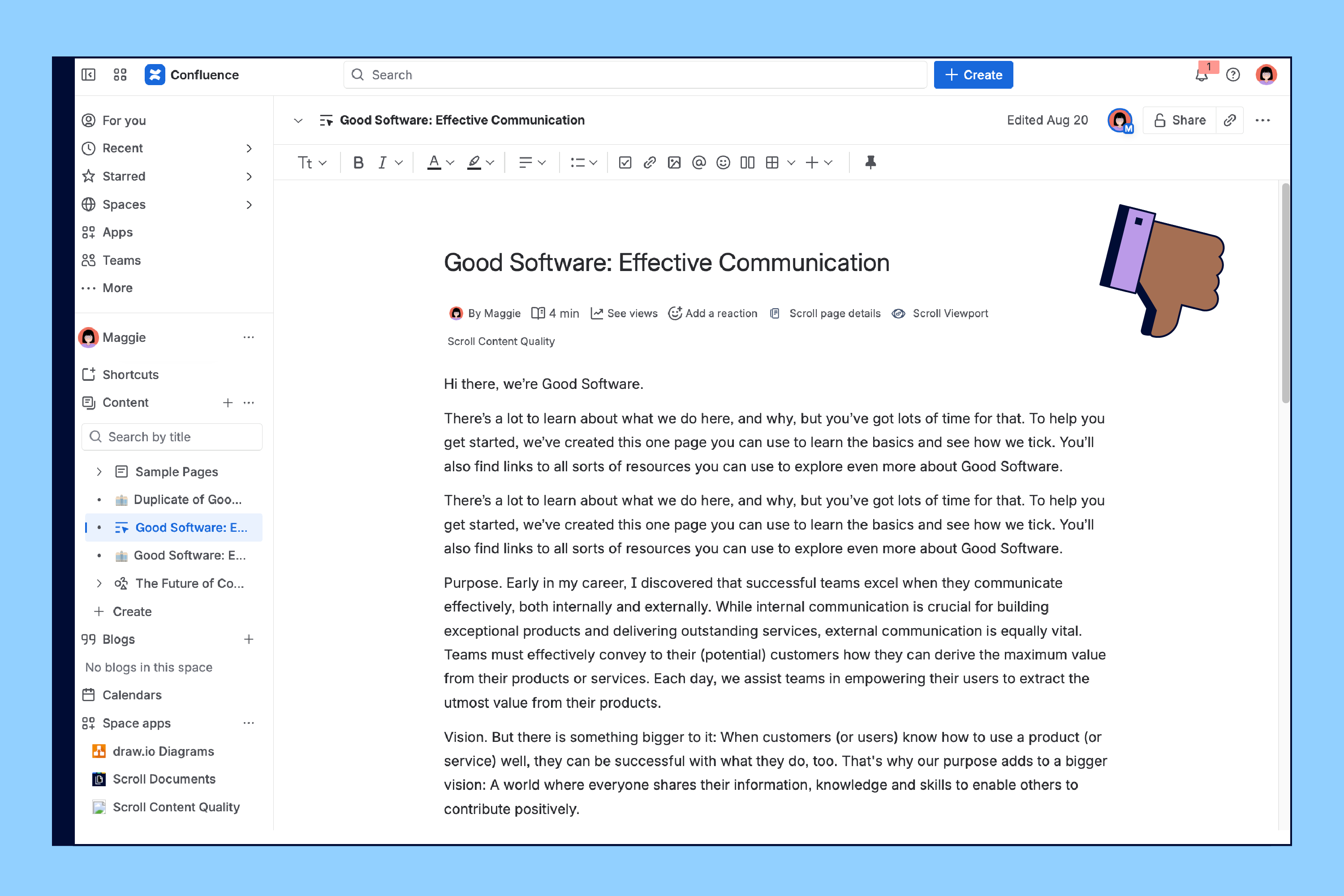
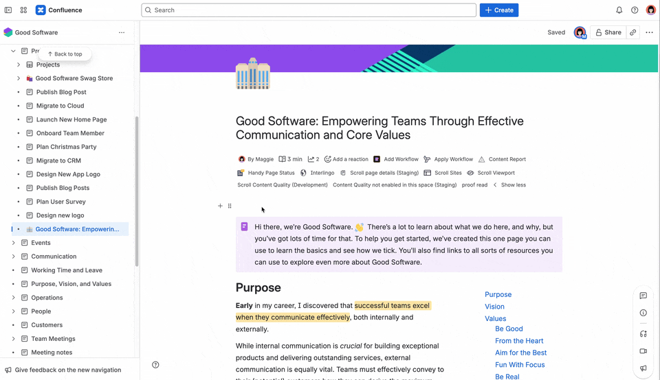
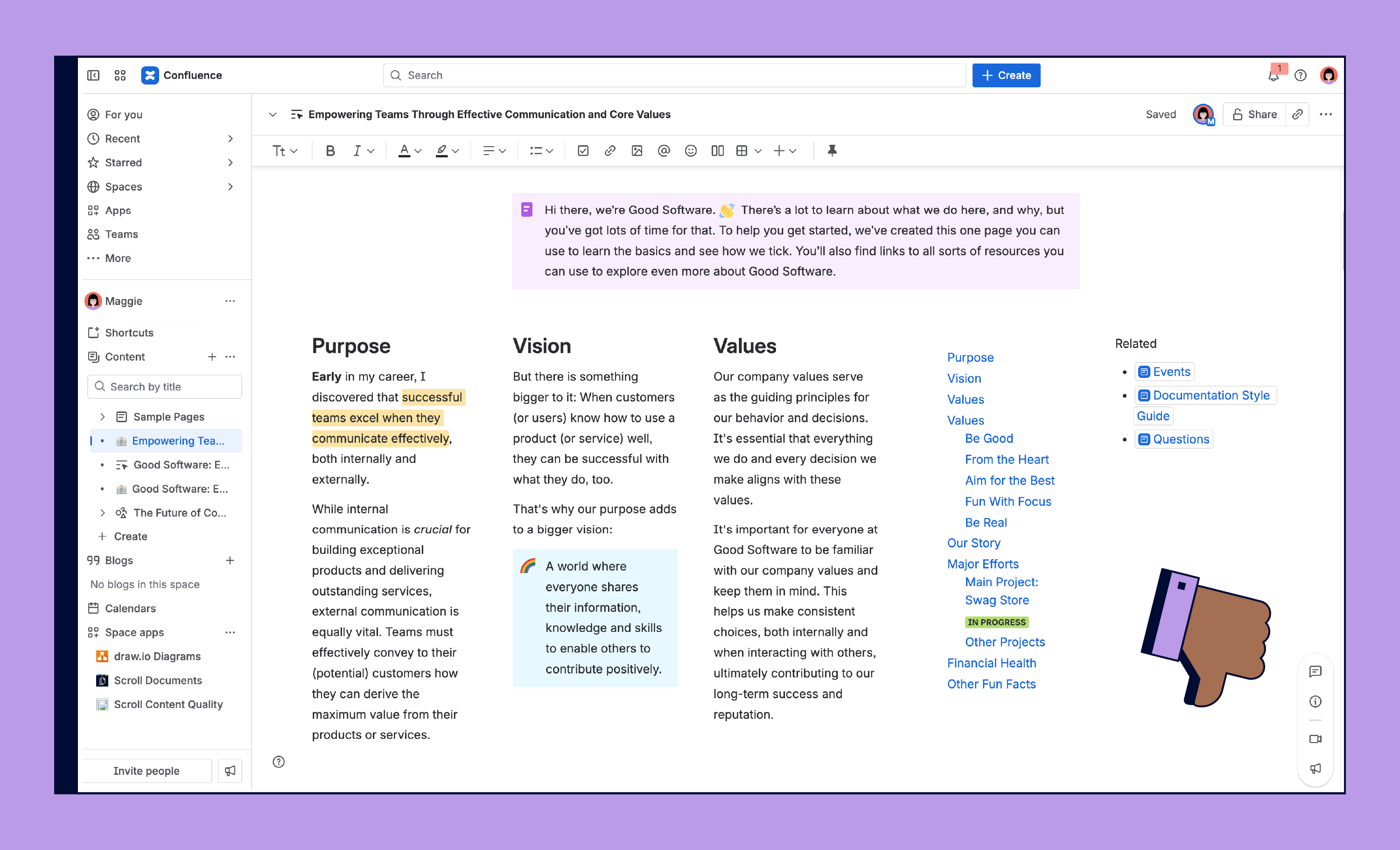
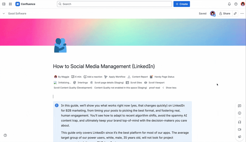
Look at this Confluence page and be honest with yourself: Would you read it?
Research published by Time shows that 55% of people, your audience, spend 15 seconds or less on a page. To make it trickier, readers usually stick to the top half of the page, scan the left side, and actually read only about 20% of the text.
Also, not what your reader deserves. They need answers, and fast! Your content deserves to shine and be read.
The good news? With a handful of simple tips and tricks, you can create a Confluence page that's beautiful, stays skimmable, and actually gets read. We’ll guide you through best practices and share examples of well-designed pages that readers will love.
Let’s go!

Purpose Makes It Beautiful
There’s a specific reason why you’ve created a Confluence page or live doc. But if that purpose isn’t clear right away, your readers may lose interest before they’ve even started. Make sure the intent of your page shines through at the top, so everyone knows why the page exists and what they’ll get from it.
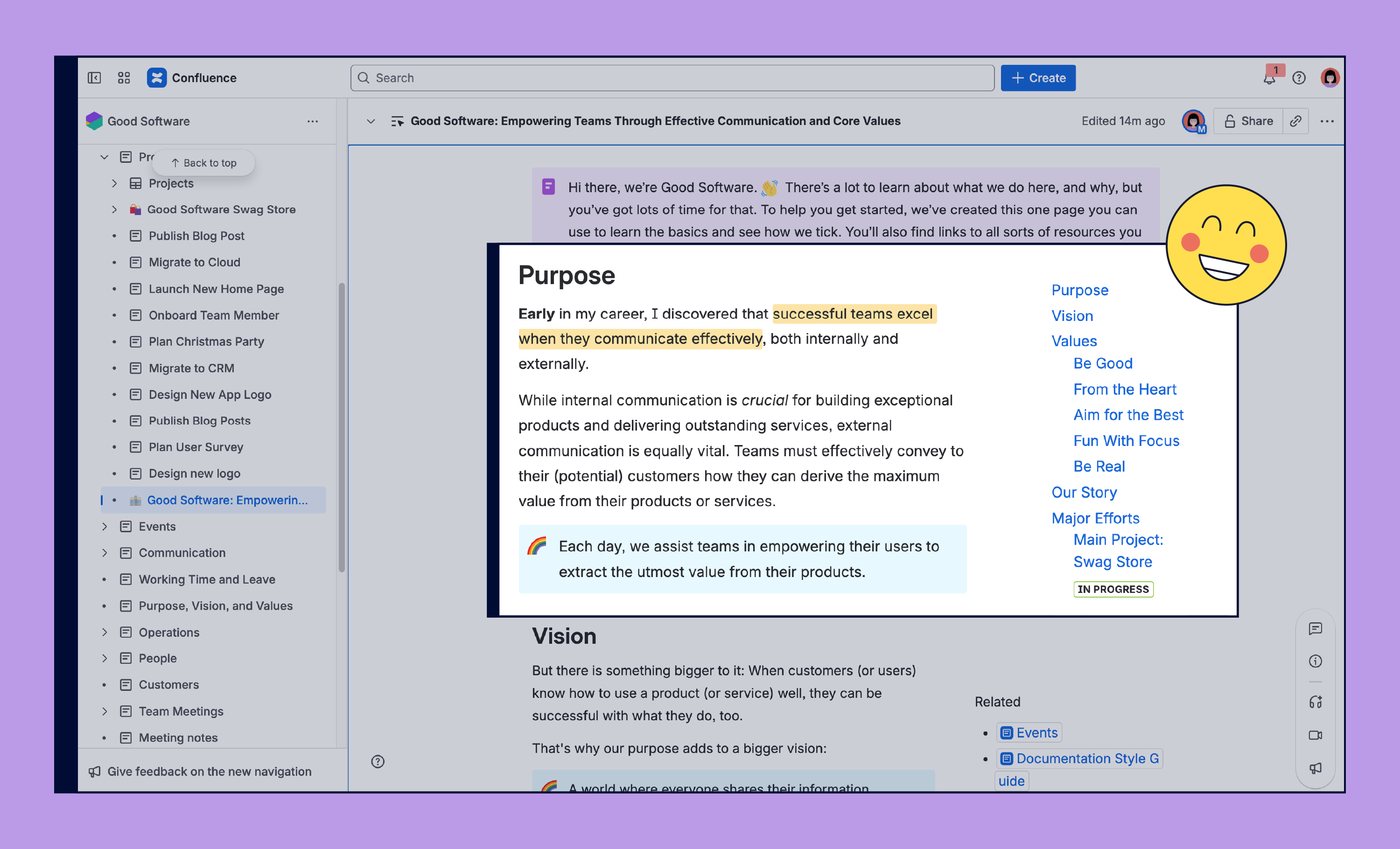
Let’s take the page we just saw as an example and optimize its design. There's a very simple rule for achieving this: put the most important information at the top of your page.
The term above the fold comes from the days when everyone read newspapers. Everything above the physical fold of the paper was what caught people’s attention first. This applies in Confluence as well.
Meaningful page titles
One of the reasons we love Confluence is, you can’t create a page without a title! But instead of calling your Confluence page something like Important Meeting, take a moment to reflect the purpose of the page and create a meaningful title. It’s not just a kindness to your teammates, it’s also a gift to your future self. Clear titles make it easier to find and understand your content later. We even wrote an entire article about why page titles are crucial.
Looking for a little inspiration? If you’re on Confluence Premium or Enterprise, you can use AI to suggest a meaningful title for your Confluence page.
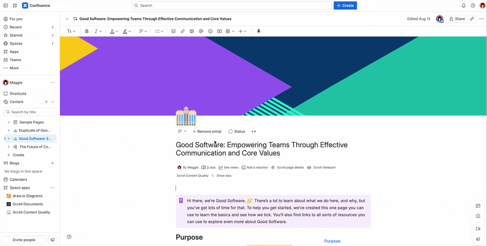
Highlight purpose with emojis and headers
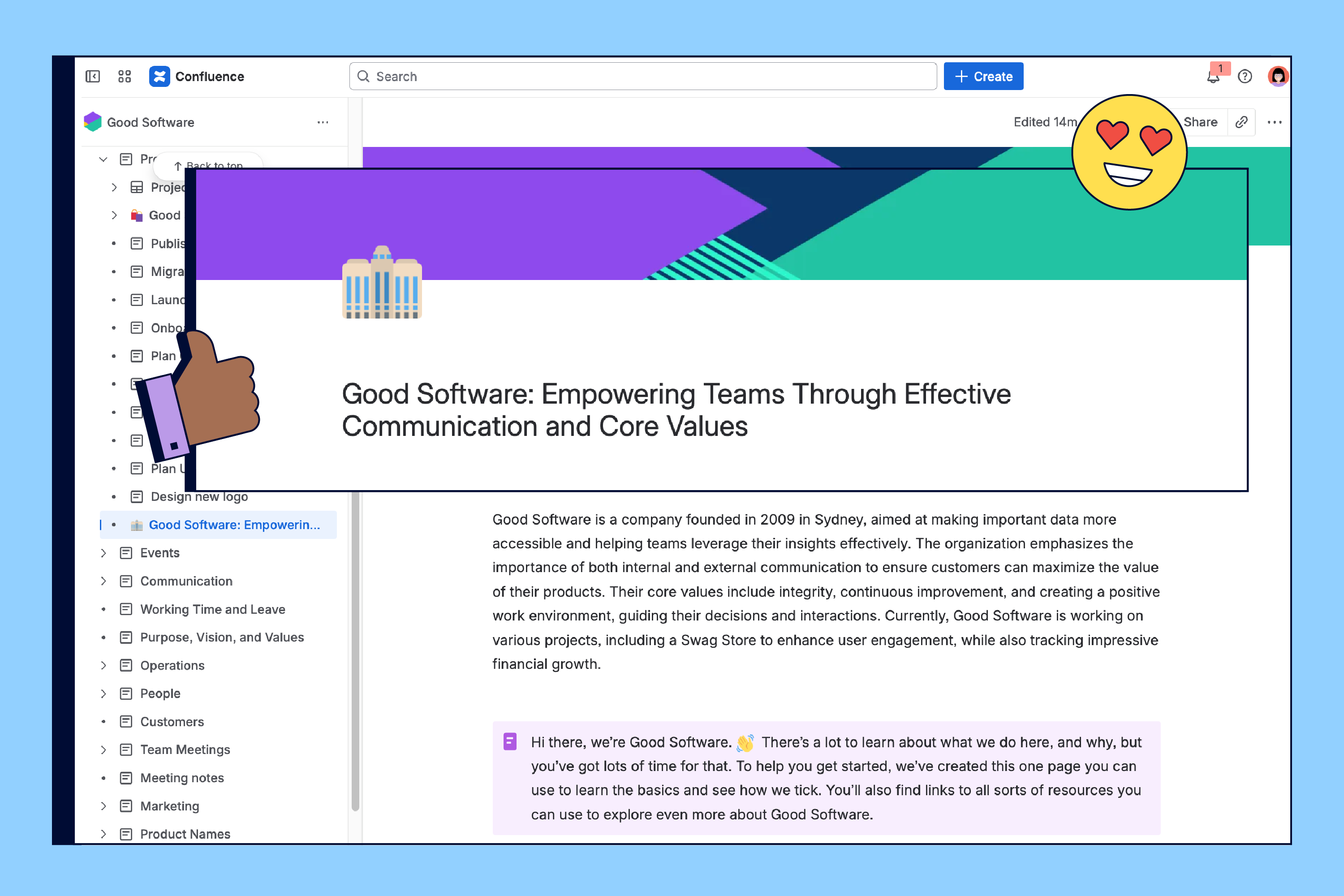
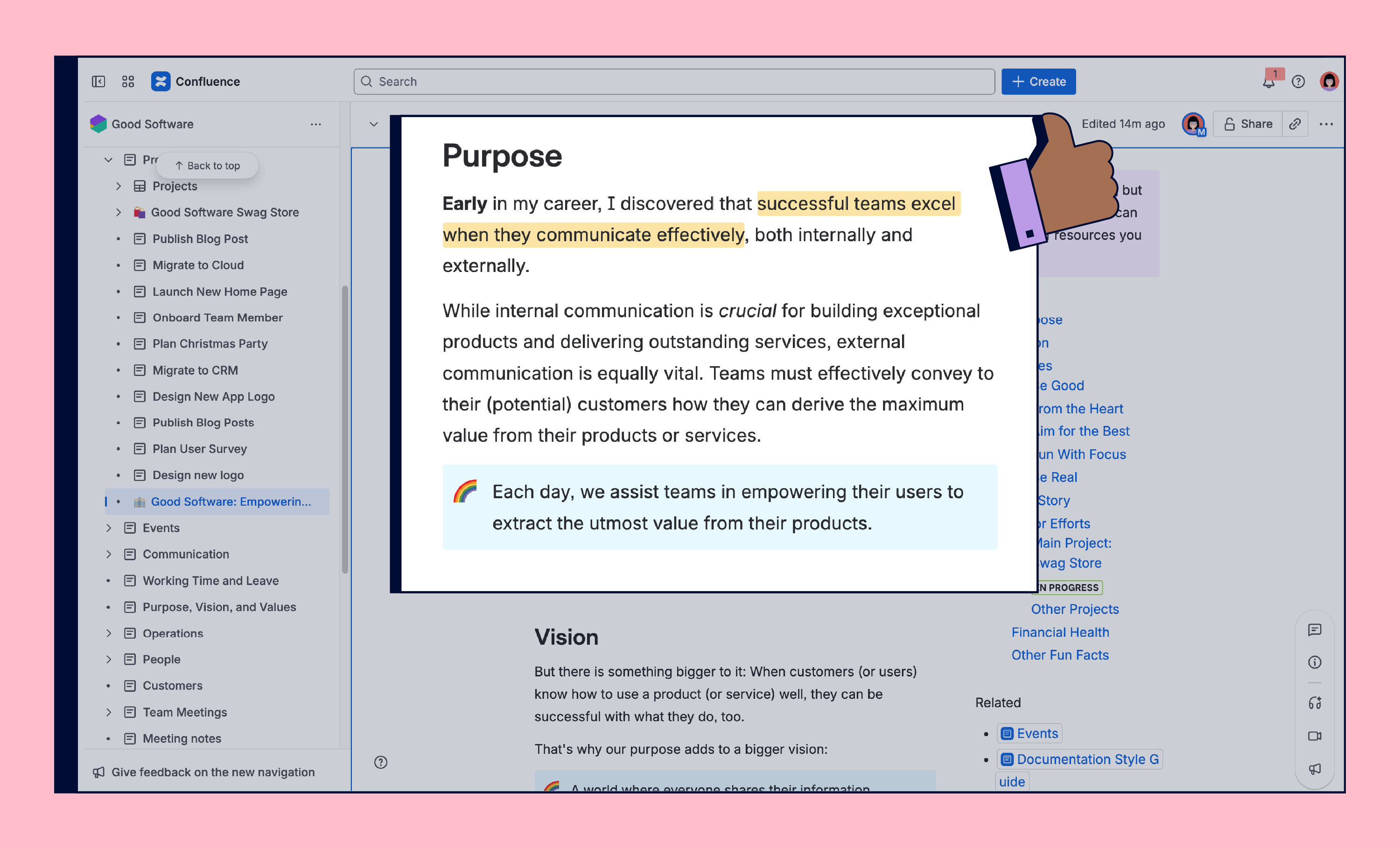
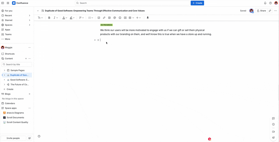
Eye-catching visuals like a page emoji or header image can quickly communicate the purpose of your Confluence page. Don’t add an image for the sake of adding one, though. If you don’t have an image that helps communicate what the point of your page is, better add none at all.
Page summaries
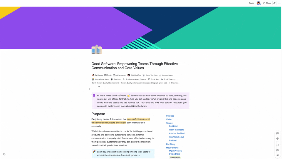
TL;DR? Having a clear summary at the top of your Confluence page makes it impossible for anyone to use “it was too long” as an excuse for not reading. A short paragraph instantly improves your page design and helps readers know what to expect. The Info Panel macro is perfect for this: it naturally stands out and catches the eye right when someone opens your page. And if you’re on Confluence Premium or Enterprise, Rovo can even write that summary for you!
Make sure to keep the text in your introductory info panel short and sweet. That way your reader is less likely to skip over the text.
Setting Layout And Width
If your company follows a strict corporate design, the most efficient option is probably to use a template for your Confluence pages. You’ll find more tips about that in our best practices article on how to create templates in Confluence.
But if you want to design a Confluence page or a live doc more freely, layouts and widths can make all the difference.
Smart alignment for better readability
Maybe you’re used to centering a title because it feels more fancy or important that way. But left alignment usually works best, especially for languages that are read left to right. It makes pages easier to scan and keeps everything lined up in a way your readers expect.
Get the width right
When it comes to width, think carefully about how your readers will consume the content. A narrow width works best for text-heavy sections because it keeps line length around 60 characters, which is easier on the eyes and the ideal length for reading content. Wide layouts are great for things like tables, charts, or images where you need the extra space. And the nice thing is, you don’t have to pick one width for the whole page, each element can be sized differently to fit its purpose. But how do you actually create beautiful tables and when should you create beautiful charts?
Columns for your layout
Column layouts are one of the simplest ways to improve your Confluence page design and make your content more engaging. But there’s a catch! Confluence allows you to create layouts with up to five columns for your pages. But just because you can do something doesn’t mean you have to–or even should.
When different layouts make sense:
-
Two columns: Perfect for pairing text with visuals. For example, instructions on the left and screenshots or diagrams on the right. This setup makes it easier for readers to follow along step by step.
-
Three columns: Useful for comparisons, overviews, or grouping related items side by side. Think “Plan A vs. Plan B vs. Plan C” or “Marketing, Design, and Engineering responsibilities.”
-
Four or five columns: These are best reserved for light content like quick stats, icons with labels, or feature highlights. They can look impressive on showcase or landing pages, but they reduce readability if used for long text.
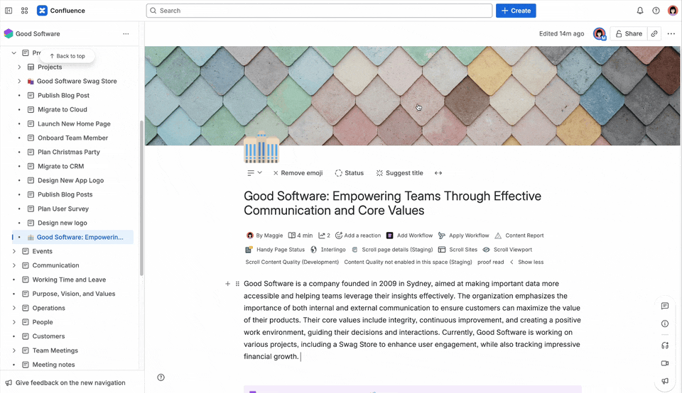
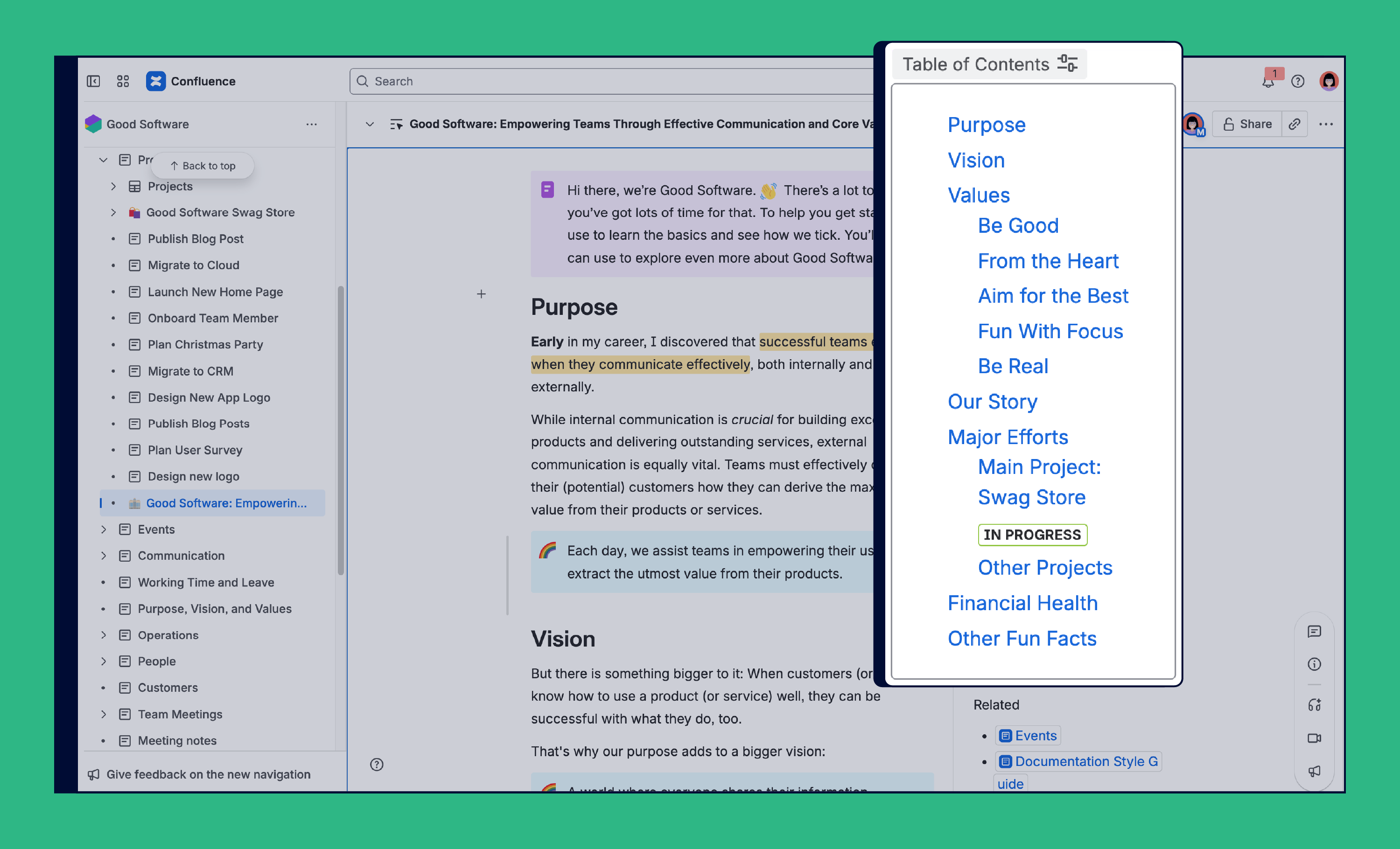
Remember that bad example page we started with? That one long, scrolling block of text? Column layouts are one of the quickest ways to break that wall apart. Here, we split it into two columns, with the main content on the left and the table of contents plus related resources on the right.
But don’t overdo it! Five columns are often a bit much, like here:
Designers like to say “let the text breathe,” and they’re right. Add dividers or a bit of white space between your sections so your Confluence page feels lighter and is easier to skim!
If you’re relatively new to Confluence and looking for an introduction to its functionality such as layouts, check out our Confluence Tutorial - Introduction to the Confluence Editor on YouTube.
Structure Your Pages
Structure is the foundation for the long-term success of your content and for every individual Confluence page. A clear page structure not only makes your content look more professional, but it also ensures your readers can quickly find what they’re looking for.
Headings for navigation
Headings are the most straightforward method of adding structure to your Confluence page. Use the highest numbered heading to indicate a new section, one heading number lower to indicate sub-sections, and so on. It’s simple advice but it really adds to the readability of your page.
A clear heading structure is also essential for accessibility. Screen readers and other accessibility technologies rely on headings to help readers understand the layout of a page and jump to the parts that matter most.
Publishing to the web
If you plan to publish your Confluence content directly to a website (for example, with Scroll Sites), keep one important rule in mind: the page title is the only H1. Search engines expect just one H1 per page, and using additional H1s in your content can hurt SEO. Inside the page, stick to H2 for main sections, H3 for sub-sections, and so on.
Add a table of contents
Adding the table of contents macro enables your readers to jump to the section they need, quickly. This also gives the reader a fairly simple breakdown of what the page contains.
A good place to put the table of contents is in the top right of your page. Use layouts to create a section at the start of your page and place the Table of Contents macro in that top right side.
Make It Visual
About 65% of people are visual learners, which means the way you present your content matters just as much as what you write. Good formatting and thoughtful use of visuals can make your Confluence page not just beautiful, but engaging and easier to understand.
Let’s look at some simple ways to make your content visually appealing with formatting and visuals.
Text formatting tips
In Confluence, you’re not limited to plain text. You can change the color, make it bold, italicize key points. and much more. But keep one rule in mind: less is more. Overdoing formatting makes pages harder to read.
When to use what:
-
Bold for must-read terms or actions.
-
Italics for emphasis or new concepts.
-
Color to group or highlight your content.
But here as well: Keep accessibility in mind. Not every person can see or distinguish each color, so make sure meaning isn’t tied to color alone. Combine color with emojis, for example, so everyone can understand your page.
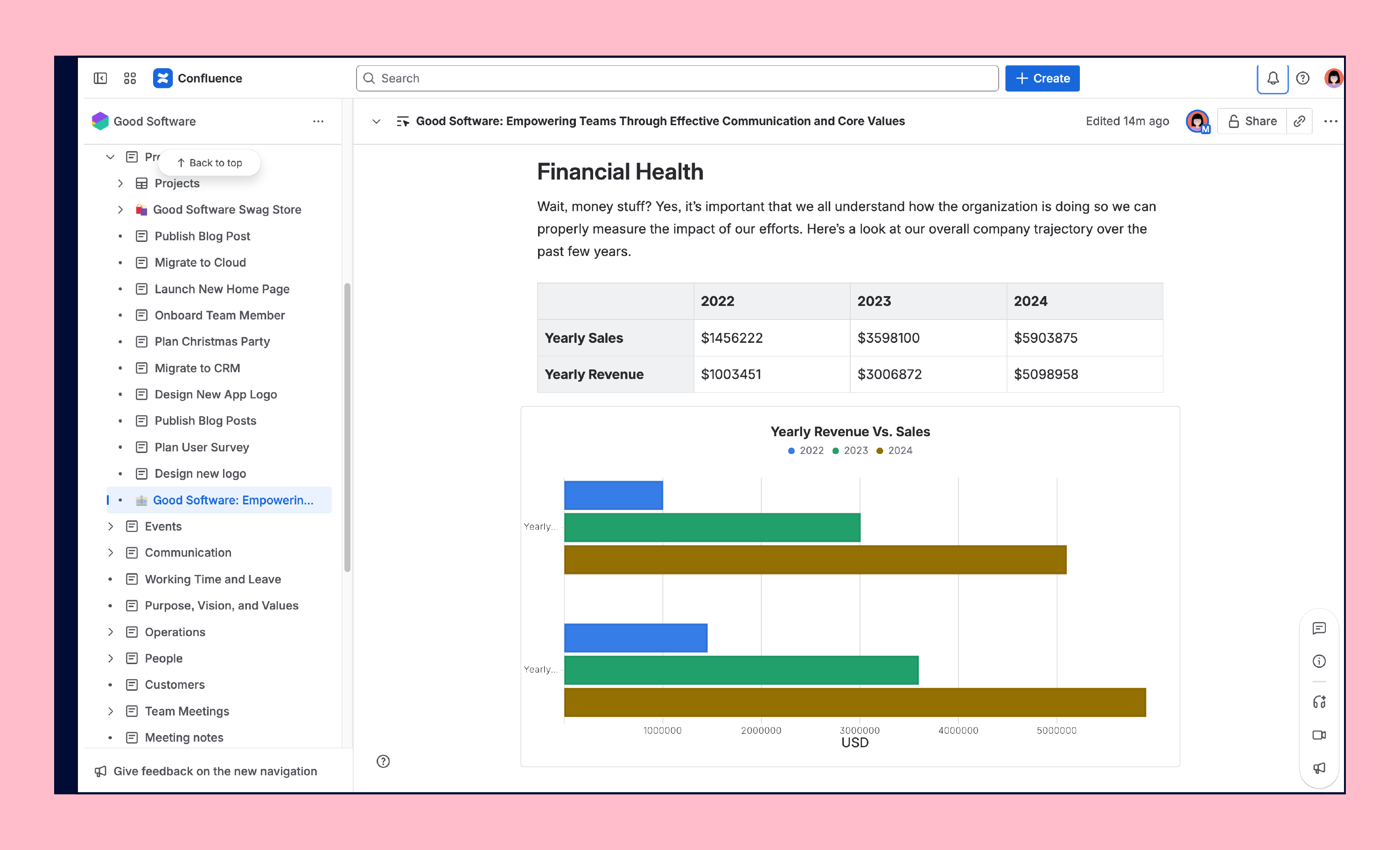
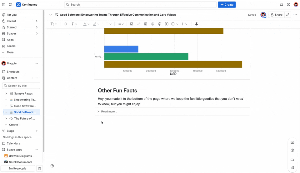
Charts and diagrams
Charts, diagrams, and other visuals turn static content into something much more beautiful and easier to understand. For example, instead of leaving numbers in a table, you can embed a chart directly in your Confluence page to highlight trends at a glance.
A picture is worth a thousand words …
… or in Confluence, it could be a thousand clicks! If you want to create Confluence pages your readers love, think of visuals as core part of your storytelling and not simply decoration. Add at least one picture or diagram per page, to give your readers an anchor (and the text room to breathe). And don’t forget to add alt text to images, so people who can’t see the image still understand what you want to convey.
Smart links
When you’re editing your Confluence page, you can add links to your text. Most URLs you paste into Confluence, automatically become smart links. That’s a feature that beautifies the way links are displayed. You can switch between different display options for each link. For example:
-
Inline link – shows up as a regular hyperlink within your text
-
Card view – creates a visual card with a title, icon, and sometimes a preview image
-
Embed view – displays the actual content of the link right inside your Confluence page (great for Google Docs, Figma files, or Jira work items)
Emphasizing And Highlighting Content
You’ve given your page some structure, and your intro and headings are all sorted out. But not all content is created equal; some parts deserve a spotlight. That’s where formatting tools and macros help you highlight the important bits to keep your page both beautiful and functional.
Here are some ideas we love to use daily to go beyond the page design basics:
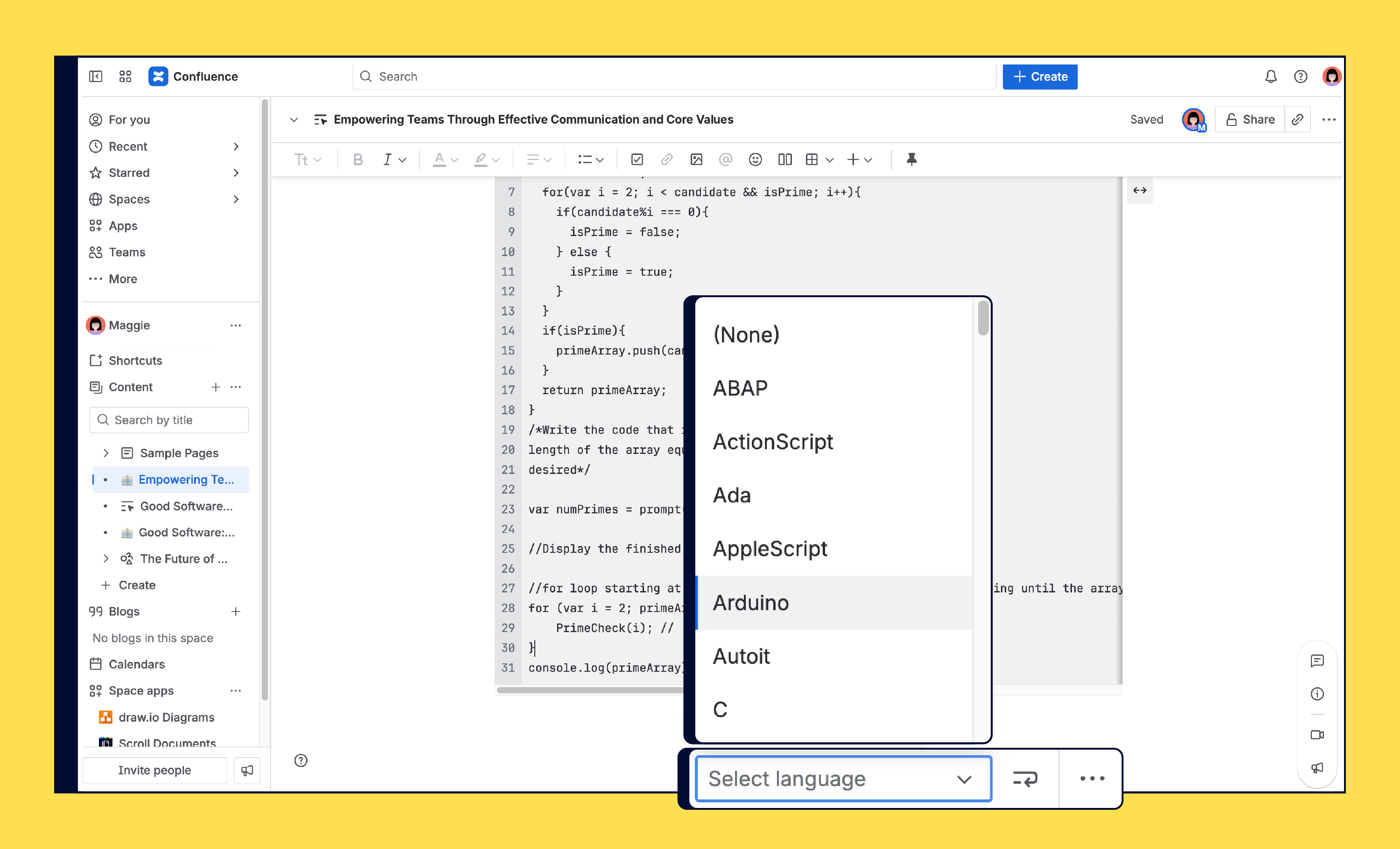
Code snippet
This macro is perfect for technical documentation, it preserves formatting and makes it easier for developers to copy and use snippets.
Premium Extras
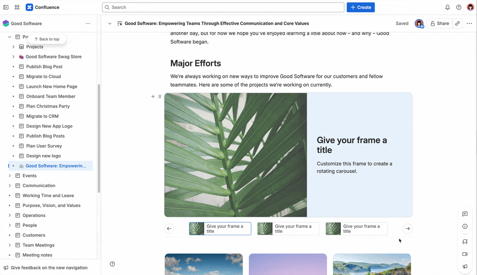
If you’re on Confluence Premium or Enterprise, try presentation macros like Spotlight, Carousels, or Cards to turn your page into something more engaging and interactive. They’re great for showcasing content (for example, product features or team highlights), but avoid using them in knowledge-heavy pages where clarity is more important than visual impact.
Want to see them in action? Jump to our video guide about beautiful Confluence pages.
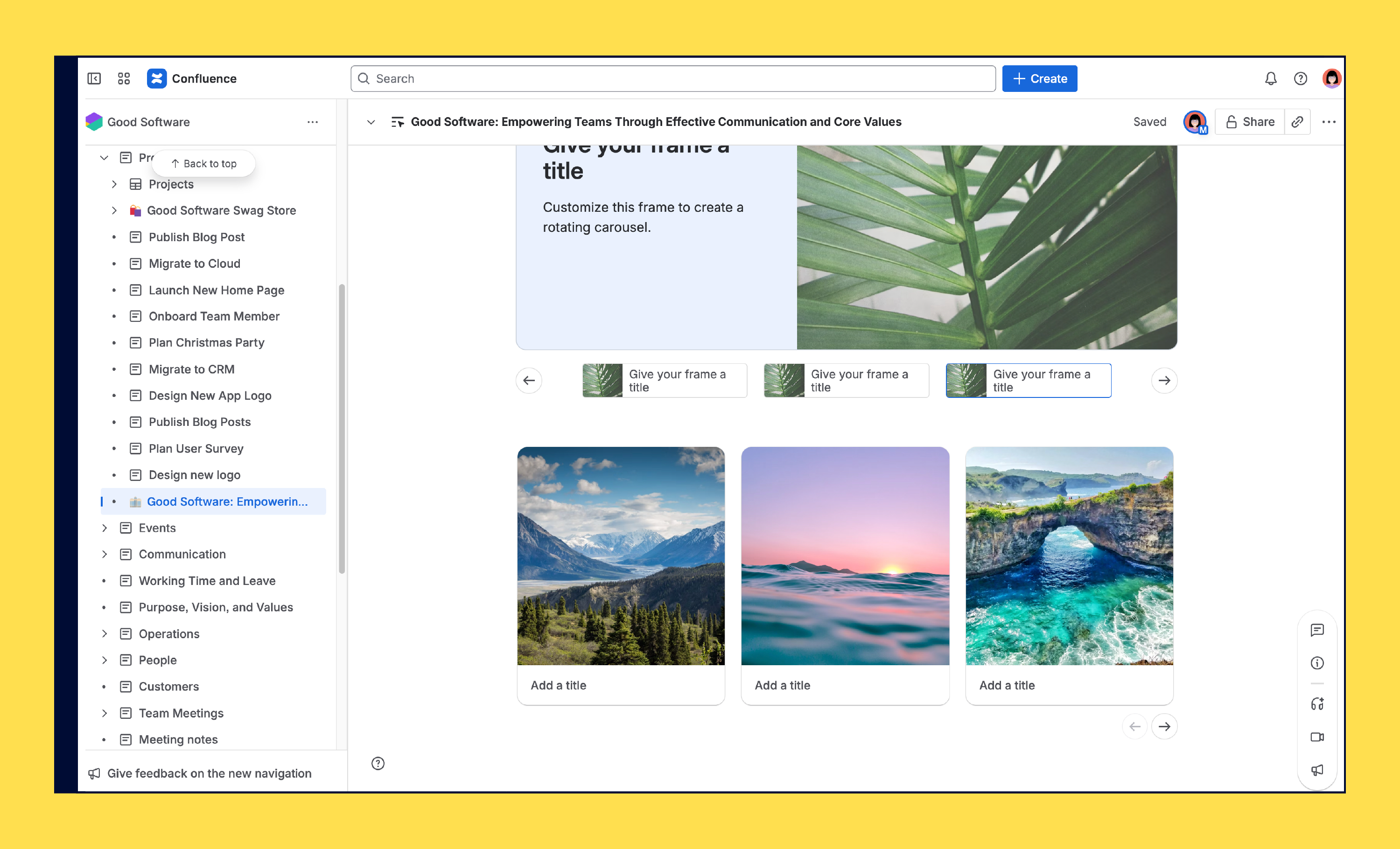
Carousels
Cards
Don’t go overboard! We’ve shared a lot of Confluence tips and tricks here, and it’s tempting to want to try every option all at once. But cluttering your Confluence page design with unnecessary elements doesn’t make it more useful. It makes it harder to read. Remember, it’s not just about how to use macros in Confluence. The real best practice is knowing when to use them.
A Beautiful Finish For Your Confluence Pages
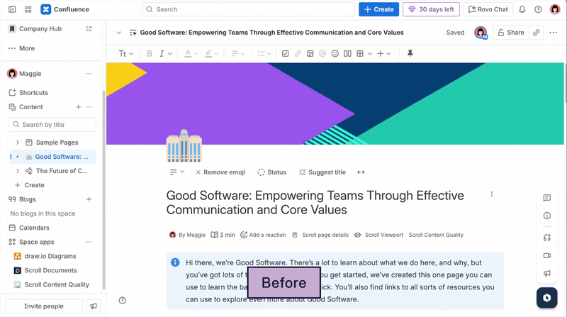
Now let’s take a final look at what your Confluence page used to look like at first glance, and now the end result after we optimized the design for better readability and usability.
Much better, right?
More Examples of Beautiful Confluence Pages
Of course, these are just a few examples of how you can create a beautiful Confluence page using built-in features. But you don’t have to stop there. The Atlassian Marketplace offers powerful apps that can take your Confluence page design to the next level.
Here are some ideas how to boost the design of your Confluence pages using built-in features:
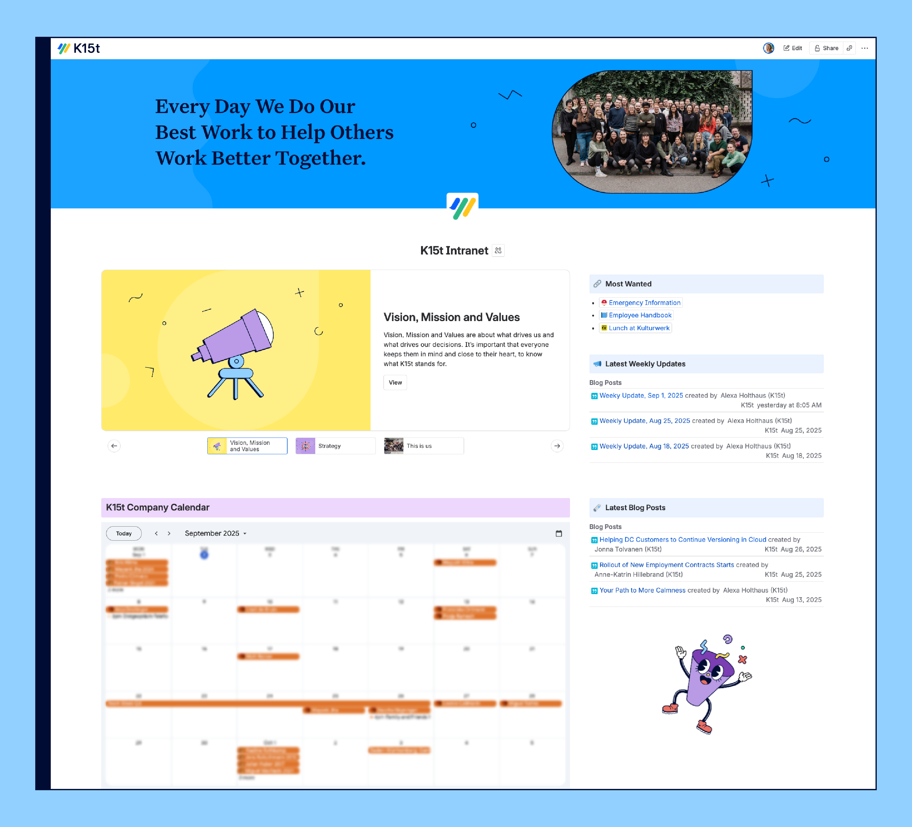
Confluence Intranet Example
Project Plan in Confluence
Example Confluence Strategy Plan
Another Beautiful Project Page
Beautiful Pages Start With The Basics
Made it to the end? Then we must have done something right with our structure and design. Now it’s your turn to apply these best practices to your Confluence pages so readers stay engaged and enjoy reading your content.
Remember these tips:
-
Write clear, descriptive titles with context
-
Add a brief introduction to set expectations
-
Use the Table of Contents macro for longer pages
-
Break up text with images, diagrams, or visual anchors
-
Keep layouts clean and add breathing room
-
Highlight key points with panels and macros
Start here, and you’ll have beautiful, well-structured pages that make your content shine without extra effort.
