Studies show that when diagrams are used, people understand and remember information better than with text-only formats. So if you want your Confluence documentation (or really any type of content) to stick, adding diagrams is a great place to start.
And don’t worry if you’re not the “diagram person.” Creating clear, good-looking diagrams in Confluence is easier than ever, especially with the latest whiteboard features.
We’ll show you how!

What Are Diagrams?
To get the most out of Confluence diagrams, let’s start with a basic understanding of their benefits. Diagrams are visual aids that convey information quickly and easily. Through diagrams, we can map out processes, structures, goals, or roles, leaving no room for ambiguity.
There's a difference between a 'diagram' and a 'chart'.
Diagrams show how something works or the relationships between parts of a whole (e.g., a process), whereas charts graphically represent numerical data.
Benefits of diagrams
In Confluence, diagrams can live alongside your written content. Let’s take a product documentation page. Think about the last time you read a step-by-step technical guide. How much of it did you actually understand just from the text alone?
Exactly.
Some information simply isn’t meant to be read – it’s meant to be seen.
Here’s what diagrams bring to the table:
-
Time saving: By presenting plans in a visual format, you understand processes and relations faster and can decide quicker.
-
Mobile readability: Clean, scannable diagrams remain usable on phones and tablets, so they’re a great content source for quick checks on the go.
-
Accessibility: Well-designed diagrams can make your documentation more accessible, especially when paired with other visuals like screenshots or videos.
-
Levels-up collaboration: Within a team or across teams, with diagrams, you’ll understand the other teams' ideas.
-
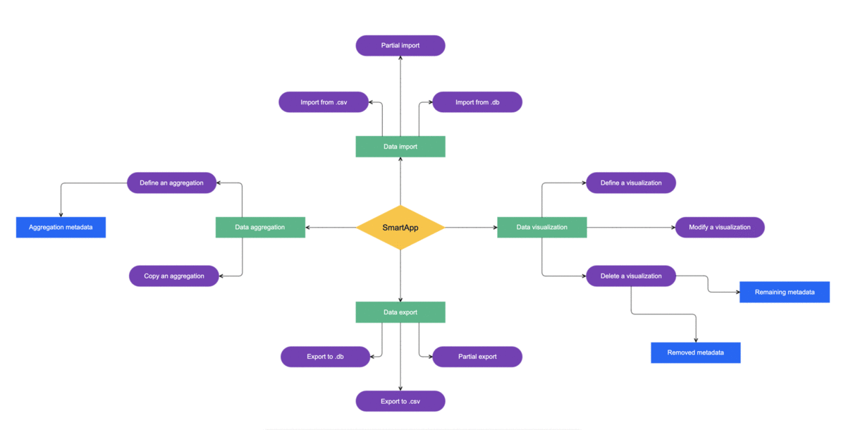
Versatility: You can use different types of diagrams for different needs. For example, flow diagrams for processes, mind maps for brainstorming, or UML diagrams for software design.
When To Use Diagrams in Confluence
Use diagrams in Confluence whenever you need to make complex ideas easier to grasp, whether that’s visualizing a process, showing how different pieces of information connect, or mapping events and goals over time.
Diagrams come in many forms, and each type serves a specific purpose.
Here are a few common examples of when (and what type of) diagram to include in Confluence:
|
When to Use a Diagram |
Type of Diagram |
Example in Confluence |
|---|---|---|
|
Explain a process or workflow |
Flow diagram |
Show the steps for onboarding new employees, from contract signing to first-day setup. |
|
Visualize progress or activities happening at certain times |
Timeline diagram |
Display product release milestones for the next quarter or key project deadlines. |
|
Brainstorm or structure ideas |
Mind map |
Organize ideas for a new feature set or marketing campaign, branching from a central topic. |
|
Compare or overlap information |
Illustrate how product features overlap across different user personas. |
|
|
Show hierarchy or relationships |
Organizational or tree diagram |
Map out your company’s team structure or show how features connect within a product. |
|
Define goals and challenges |
SWOT diagram |
Visualize strengths, weaknesses, opportunities, and threats for a product launch. |
|
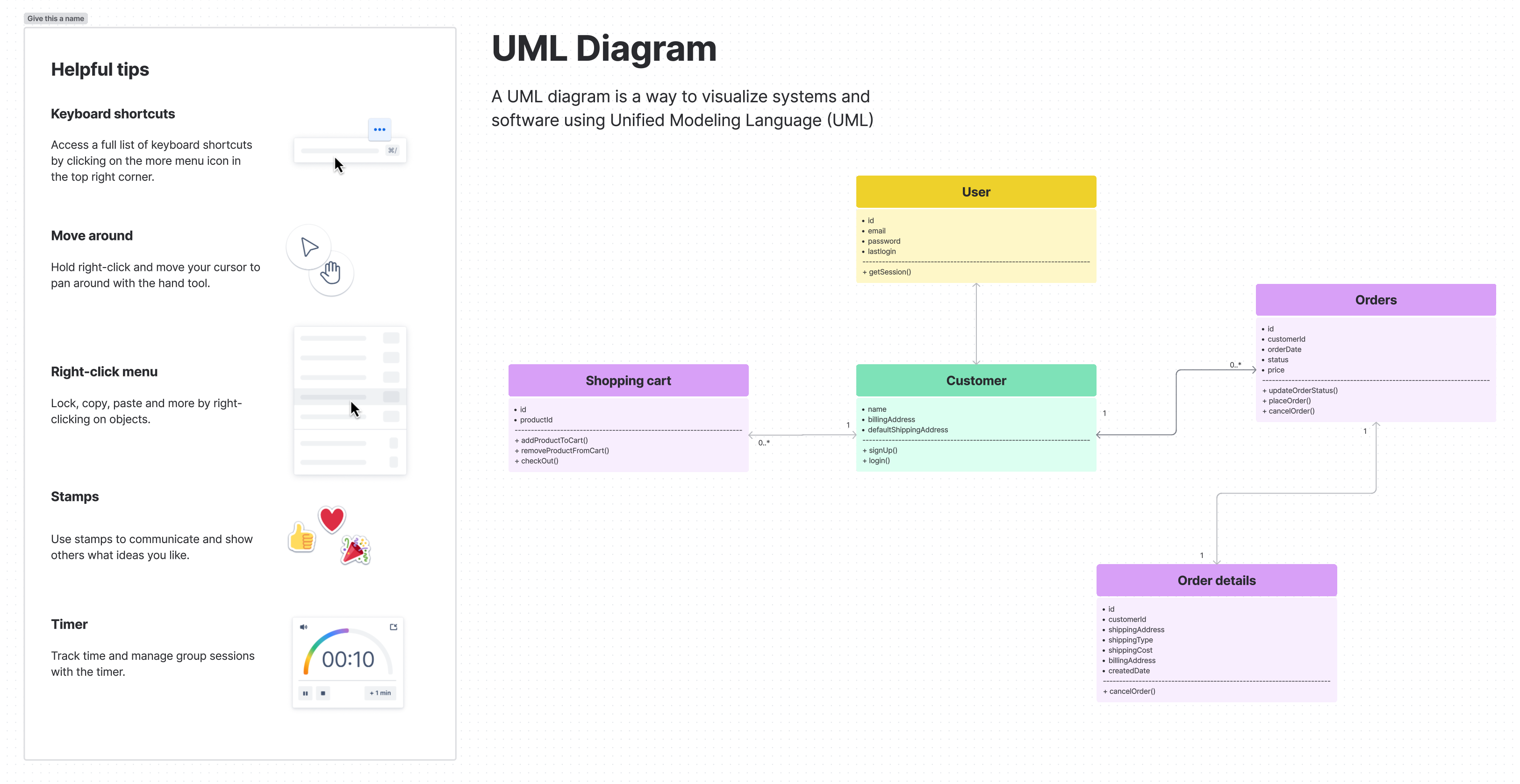
Design or document technical systems |
Explain how backend services communicate in your software architecture. |
|
|
Visualize a layout or interface |
Wireframe |
Sketch the layout of a new help center page before design implementation. |
|
Illustrate hardware setups or system architecture |
Wiring diagram |
Show how servers, devices, or network components are connected in an IT infrastructure. |
|
Represent data or logic using simple text-based syntax |
Mermaid diagram |
Use code blocks in Confluence to generate sequence diagrams, flowcharts, or Gantt charts that stay version-controlled and easy to edit. |
How To Make Your Confluence Diagrams Look Great
We're all told not to judge a book by its cover. But sometimes it's hard not to. The same principle applies to your diagrams. If they're not attractive, they'll be scrolled past and forgotten. Or worse, they could give false information or reflect poorly on your brand. Ensure your diagrams don't get 'left on the shelf' by putting some effort into how they look.
https://youtu.be/ZxoQlfi8P38?si=MgX6cnJJkeTFRqfi
Apply the following rules to create diagrams that are useful, easy to understand, and also great to look at:
Stick to a color theme
-
Use color deliberately and strategically to convey meaning in your Confluence diagram. When used correctly, color can direct attention, improve readability and comprehension, and promote association and recall of information.
-
Stick to a color theme and limit the number of colors that you use (3 or 4 is recommended). These can mirror your brand's colors if suitable.
-
Consider color-blind friendly palettes, patterns, or labels to distinguish between categories to help those who are visually impaired.
-
Use different colors to provide contrast between different objects and shades of the same color to show relationships between objects.
Pay attention to typography
Fonts
-
Since you want font within your diagrams to be readable, avoid complicated ones. The two major categories of fonts are serif and sans serif. Serif fonts are more formal; sans serif are more modern.
-
Refer to your brand guidelines and use a simple font that's used elsewhere for your brand if possible.
-
Use different font weights (light, regular, and bold) to emphasize certain pieces of text.
Size and color
-
Make sure the font color stands out. For faint colored objects, use dark text. For bold colored objects, use light text.
Readability
-
Less is more - don't add too much text into your diagram as this defeats the object of having a visual tool.
-
Use as little text as possible as it can't be translated. Label objects with numbers, then include a numbered list within your documentation detailing what each element is. This means you can reuse diagrams easily when the written documentation gets translated into different languages.
Other diagram styling rules
Diagram standards
-
Choose the right type of diagram to fit the context. If unsure, look up the standards for particular diagram types.
-
If you start to notice your diagram is very complex, consider breaking it down into simpler diagrams that will be easier for users to understand. This will help them focus on a specific part of a process, timeline, etc.
Readability
-
Don't pack objects together too tightly and keep plenty of whitespace in your diagrams.
-
Ensure diagrams can be read easily within the documentation – especially on mobile devices – without needing to zoom in.
-
Standardize the size of your diagram's objects for consistency and align them in a logical way so they look neat.
-
If your brand doesn't typically use shadows, think carefully before applying them to objects as it can look off-brand and cluttered.
Here's an example of a good vs. a ‘bad’ diagram. The 'good' diagram on the left is easier to understand and much more effective:
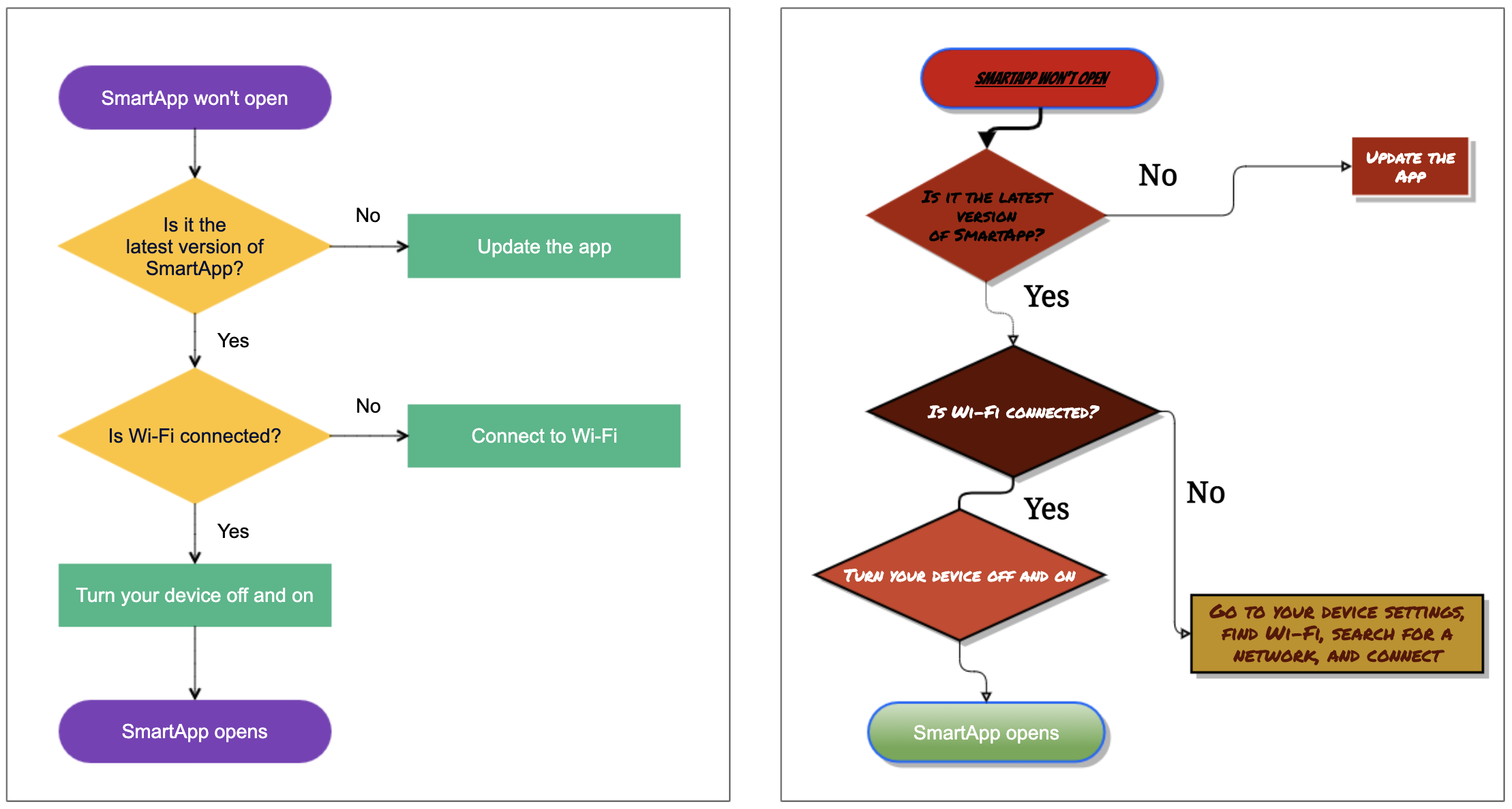
With the above tips in mind, remember that consistency is the key to creating easy-to-follow diagrams – your users will appreciate your effort.
Confluence as Diagram Maker
When you’re wondering how to draw diagrams in Confluence, the easiest way would be: Whiteboards. Yes, the same tool known for its collaborative brainstorming capabilities can now be used to make diagrams, too.
You can keep things simple by selecting a diagramming template right when you create a new Whiteboard, such as a Venn diagram, UML diagram, flowchart, org chart, and many more.
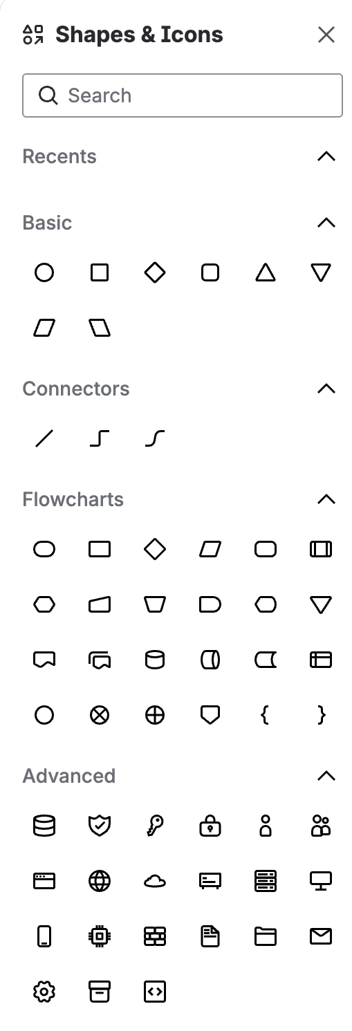
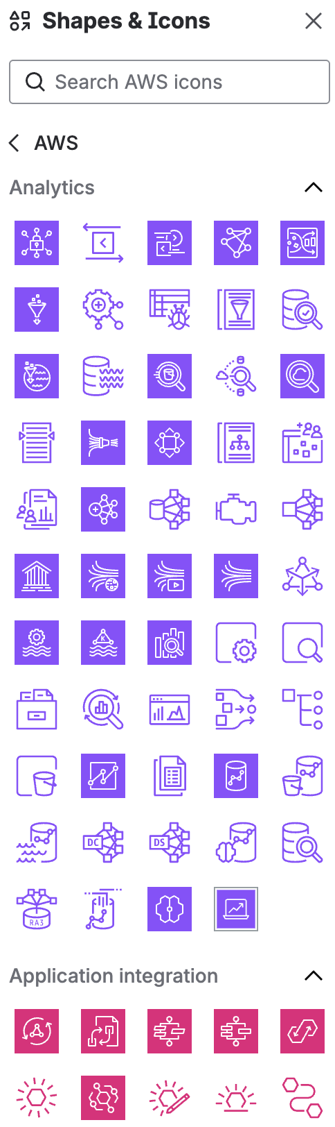
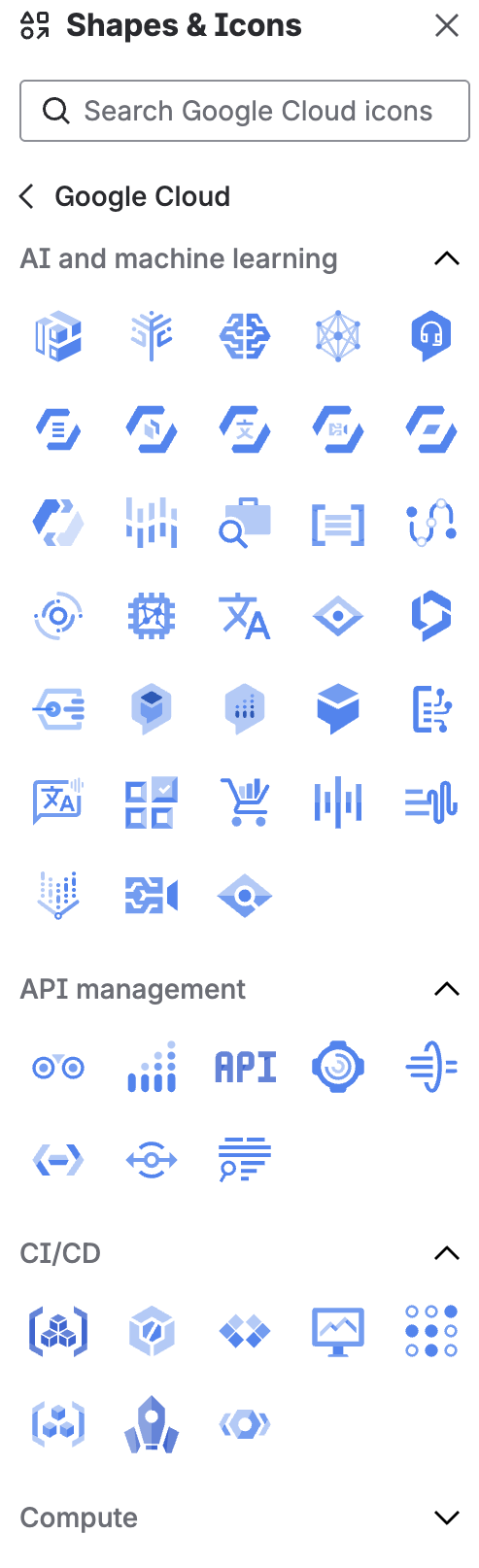
If you prefer to start from scratch, or want to update a diagram you created from a template, you can choose from a wide variety of shapes, including flowchart symbols, architecture icons, and mind map elements.

Real-time collaboration is built in, so your whole team can contribute, vote, and iterate together.
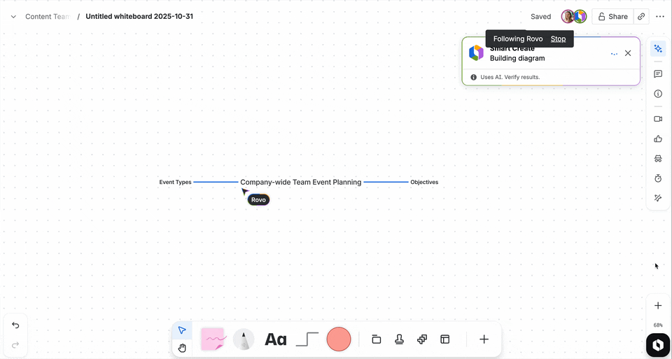
For teams on Premium or Enterprise plans, Whiteboards also unlock AI-powered capabilities like Smart Create, with Rovo, as you can see below:
Curious to know more about Whiteboards? Then you should take a look at our best practice article on Confluence Whiteboards and also exclusive Whiteboard webinar with Emily Ditchfield, Senior Product Manager at Atlassian.
Other Tools for Diagramming in Confluence
Even though Confluence supports diagrams natively through Whiteboards, there are still some reasons when you might want to use dedicated diagramming apps like http://draw.io and Gliffy.
Both apps allow you to create and collaborate on diagrams with your team. You can build together, give feedback together, and improve on them together. Although either tool will get the job done, they have some differences. Check out the Atlassian Marketplace listings for each app to see which one is the best fit for your team:
Publish Your Diagrams for Your Users
Adding diagrams to your Confluence content will make certain topics easier for users to understand – remember the step-by-step guide without any graphics! Using diagrams alongside other visuals like screenshots, GIFs, and videos will develop your content in a meaningful way.
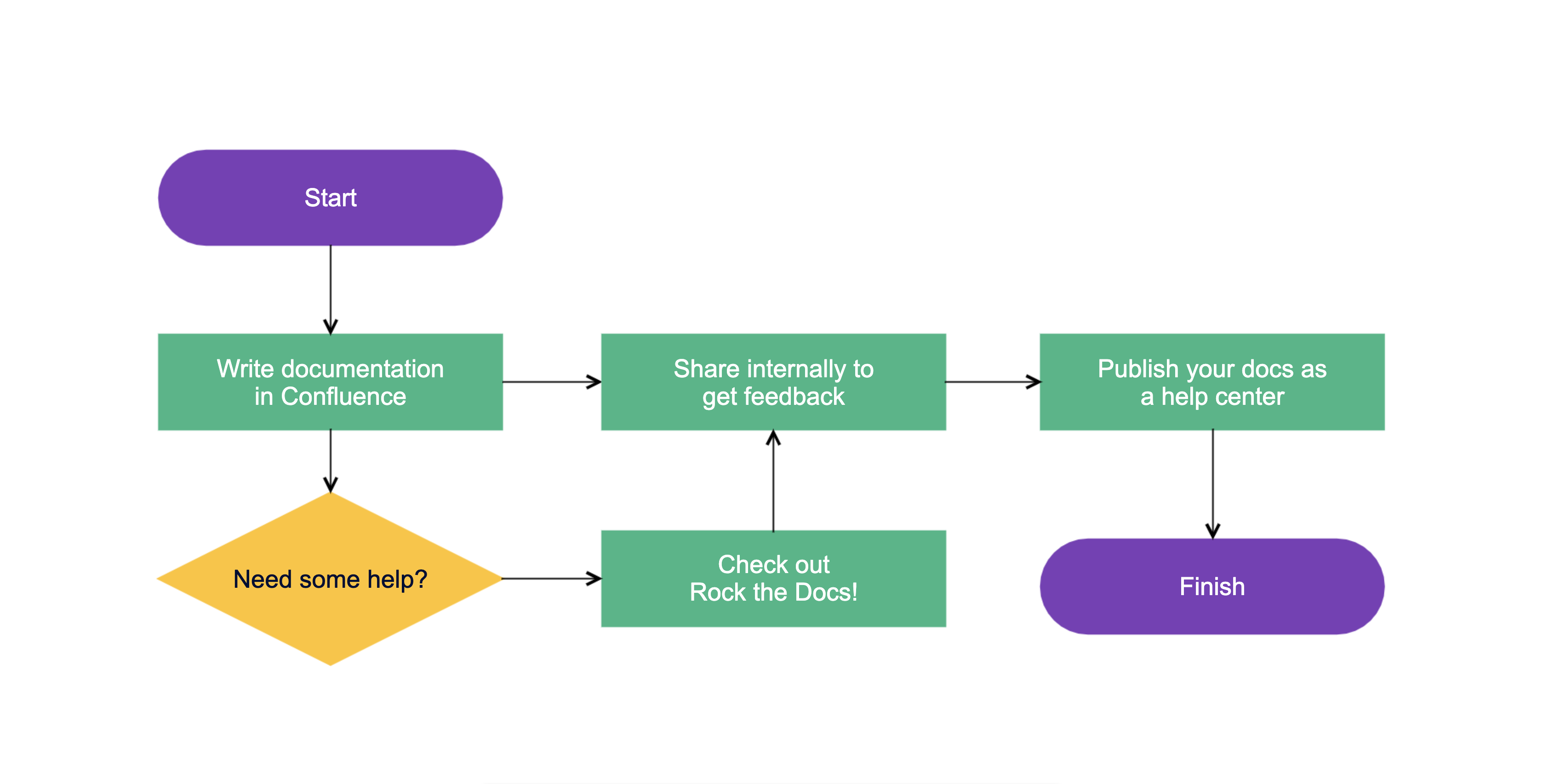
If you use Confluence to write your content, especially documentation, and publish it easily as a help center using Scroll Sites – draw.io diagrams are included! Scroll Sites handles the formatting of your Confluence content, and each time you make changes to your diagrams in Confluence, you can easily publish the updates to your help center too. Scroll Sites help centers can be available publicly or restricted – so you can control who sees your content.
Harness the power of visualization in Confluence. Get started →
